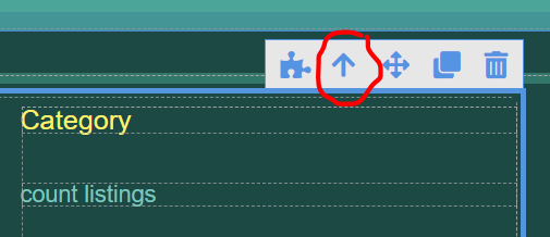
Hi I’m constantly using the “Up Arrow” component selector in UI Builder. It would be great if you could also put a “Down Arrow” as well since it’s annoying to need to switch to the sidebar tree navigator everytime I need to select something underneath the current component I’ve highlighted. Thanks!

For any component there is only one parent container. The “Up Arrow” selects the parent. By that token, a parent may have multiple child components and the “Down Arrow” would be ambiguous when deciding which child should be selected.
I did think about that but perhaps the down arrow could just cycle through the multiple children if they existed within a parent container. There’s enough visual cues on the component highlights I think to where this wouldn’t be confusing.
Thanks for the suggestion! As with any feature we have to weigh it against the level of effort and impact. With other things we’re working on (such as reusable components), I think you’d agree that it would be of a lower priority improvement.
Regards,
Mark
U bet… just wanted to throw ideas out as they come to me. Thanks for all your great work!
1 Like
