Hey, I’m using the Select input a few times in my UI, but is looks so different to the Standard variant I use on the rest of the inputs. Would it be possible to add the Standard variant (and while you’re at it, maybe also the Filled one)?
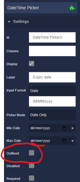
Also I noticed for the DateTimePicker you’re using a different approach (not using Variant but option to choose Outline). This leaves out the Filled option.
Hi, @Michiel_Prins
As for the first part of your post, I made an internal ticket BKNDLSS-24809 to add this functionality to the Select component.
About your notes on the DateTimePicker component. You can do it now, without additional improvements on our side. I will show you how you can do that:
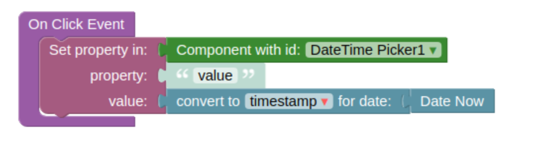
On my page I have two components: the DateTimePicker and the Button components. All of the following logic I attached to the Button component, to display the real time.
Thus by clicking on the Button component the user gets the real time which will be displayed in the DateTimePicker comontent.
Regards,
Marina
Thanks for the first part!
I don’t understand your second remark, how does that relate to the css of that input?
Michiel
@Michiel_Prins
I see what you mean. This functionality has not yet been implemented. I created an internal ticket BKNDLSS-24812 to discuss it with the team.
As a workaround, I might suggest that you use the Input component and pass data to the DataPicker using the onChange event handler.
Regards,
Marina
1 Like
I don’t understand what you mean with the workaround. I’m talking about CSS in this topic, not about data?
Just so I understand what you’re talking about. Could you attach screenshots where you point with arrows the styles in question?
Not now, my app is broken since the upgrade of the European cluster, waiting for it to work again.
Sorry for being unclear, it’s probably my English 
I will post screenshots when things are up and running again.
Thanks, Michiel. You should be able to see the app now. Post those screenshots when you can.
Normal input has Variant option:
DateTime picker only has “Outlined” checkbox to swap between normal and outlined. So there’s no Variant selectbox there to select betwee the three looks.
My first remark was about the “Select” form element, which has only the Outlined css, but not Normal or Filled.
Hope everything is clear now!
Hi, @Michiel_Prins
We’ve just updated cloud servers with the new variants of the Select component you wrote about above.
Regards,
Marina