How can I split to show two separate colors vertical with both sides able to add rows (content)?
Example: 04.02.2021-04.43.26
If i add row 12/12 (100%) I cannot split the background color into two. Even if I did 6/12 & 6/12
I accomplished above by doing row 50% and background color turquoise. But now, I cannot add text or boxes to the right side.
Would the solution be to create as an image background. I think that would result in the text overlapping the central color separation line with some different screen sizes…
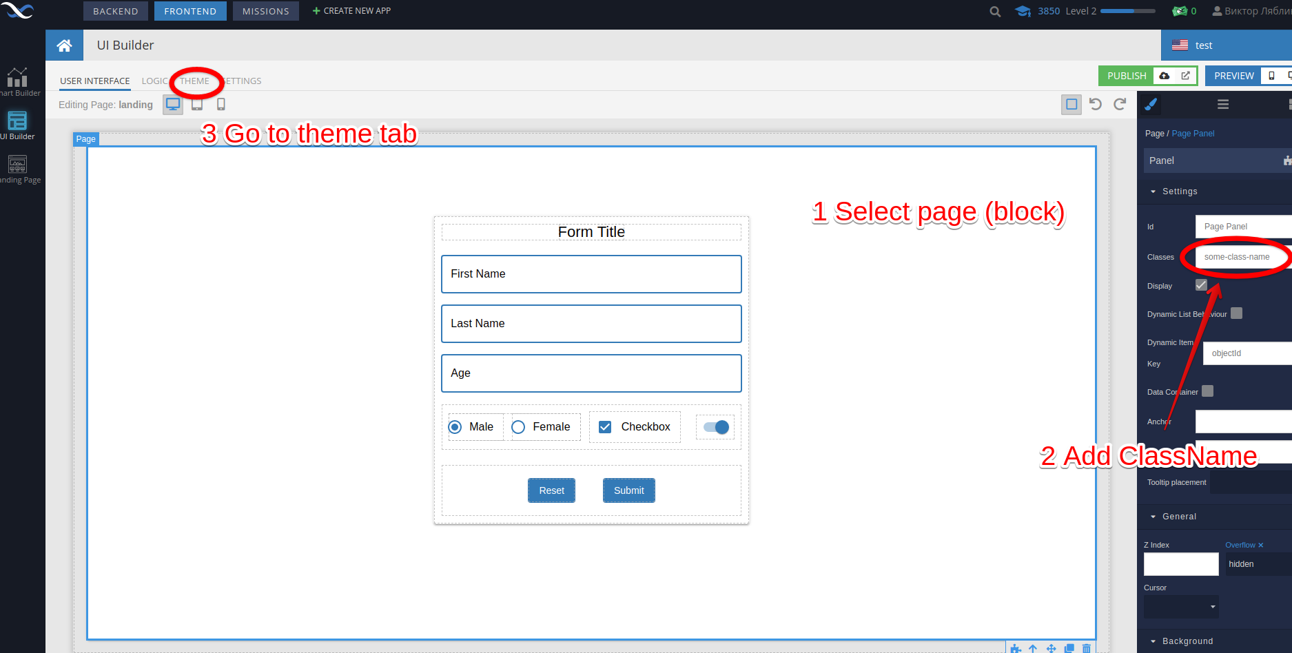
Hello @Mark_Wilkinson
Did I understand correctly that you just need to paint the background?
If so, I would do it without using blocks.
Regard, Viktor
Hi Mark,
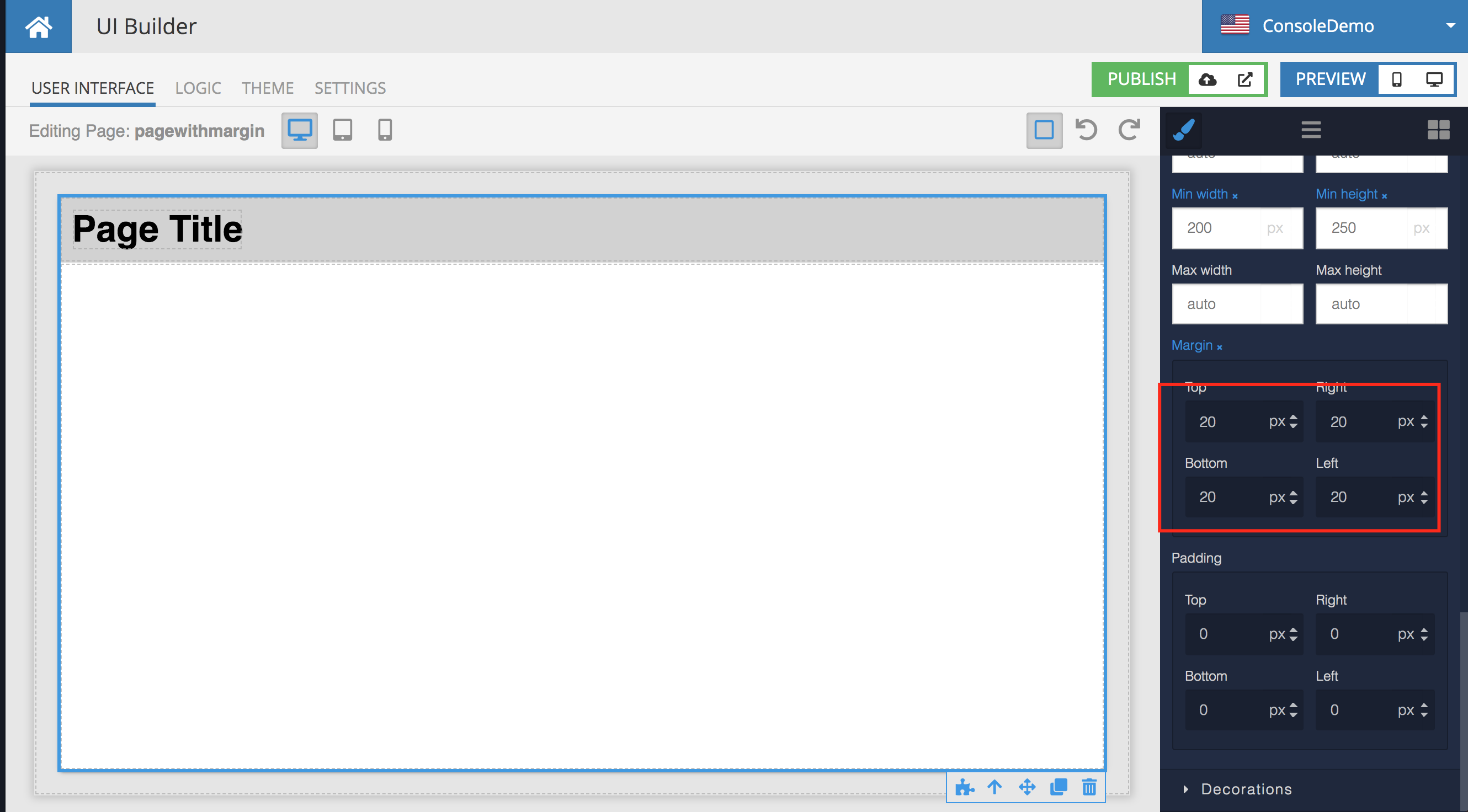
Do you need to get rid of the outer frame?
Mark
Hi Mark,
Yes. But only for this page.
Hi Mark,
If you select the outer panel that sits on the page, you can get rid of the margins using the following properties:
Regards,
Mark
Excellent. Thanks.
Have a good weekend.
Great! Thanks.
What would it be for Mobile 769px? I wish to reverse so it is horizontal.
I have tried CSS with little luck.
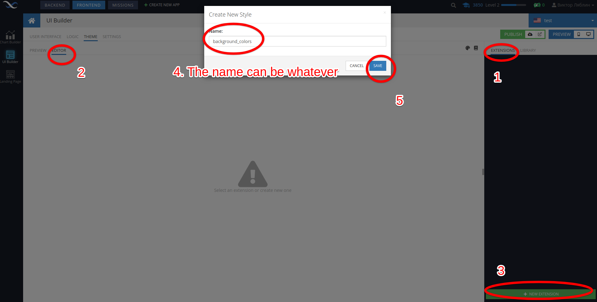
Hello @Mark_Wilkinson
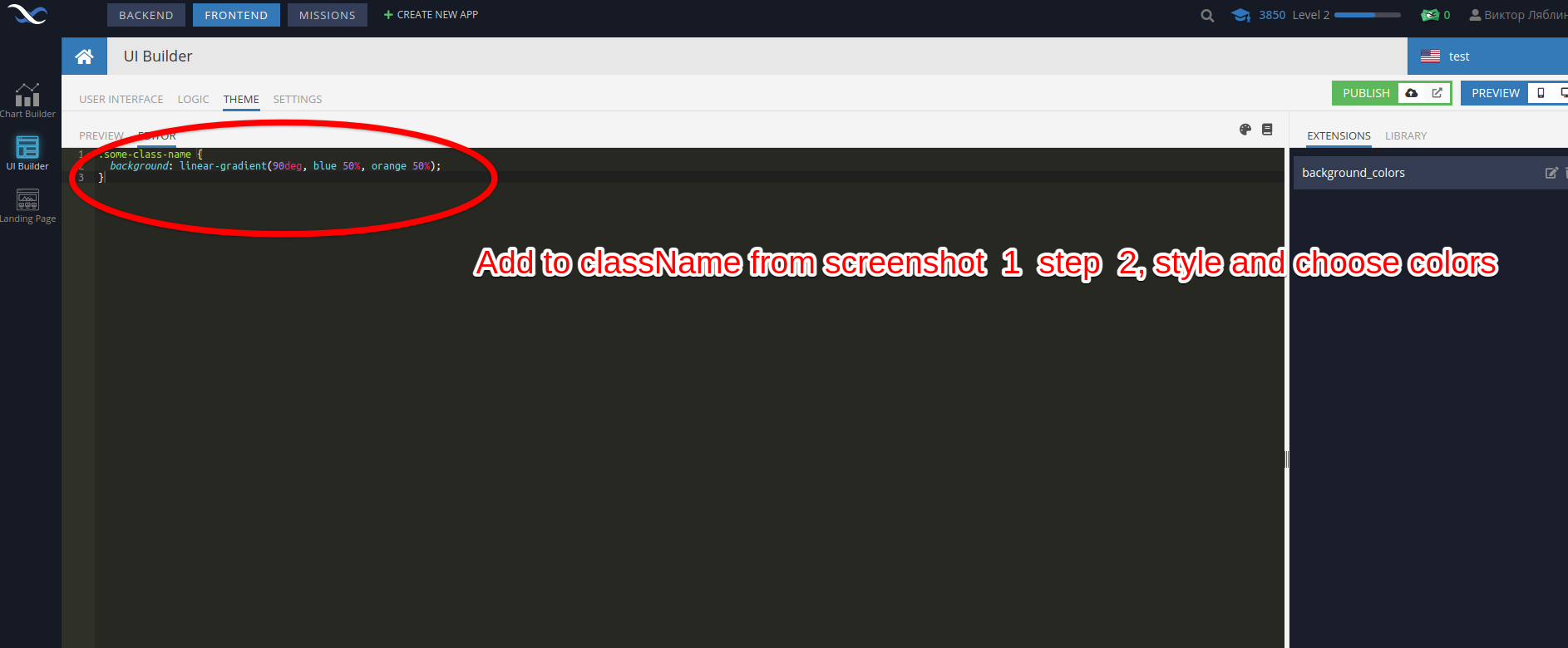
CSS Code
@media (max-width: @appLayoutMaxPhoneWidth) {
.some-class-name {
background: linear-gradient(0, green 50%, yellow 50%)
}
}
@media (max-width: @appLayoutMaxTabletWidth) and (min-width: @appLayoutMinTabletWidth) {
.some-class-name {
background: linear-gradient(0, purple 50%, pink 50%)
}
}
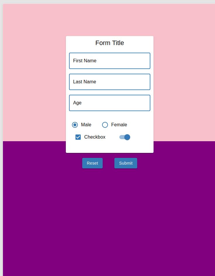
@media (min-width: @appLayoutMinDesktopWidth) {
.some-class-name {
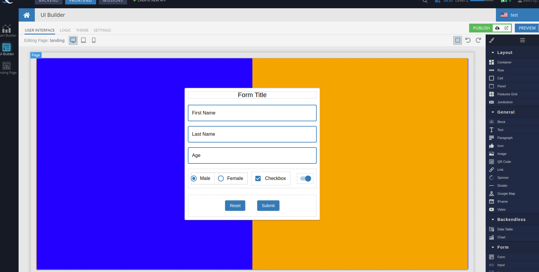
background: linear-gradient(90deg, blue 50%, orange 50%)
}
}
Instead @appLayoutMinDesktopWidth you can use custom size like:
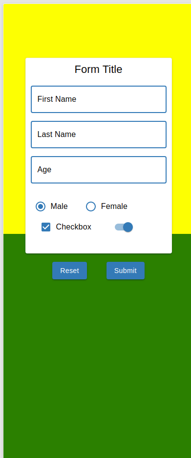
@media (max-width: 500px) {
  .some-class-name {
    background: linear-gradient(0, green 50%, yellow 50%)
  }
}

@media (max-width: 501px) and (min-width: 700px) {
  .some-class-name {
    background: linear-gradient(0, purple 50%, pink 50%)
  }
}

@media (min-width: 701px) {
  .some-class-name {
    background: linear-gradient(90deg, blue 50%, orange 50%)
  }
}
By default size vars:
@appLayoutMaxPhoneWidth: 479px;
@appLayoutMinTabletWidth: 480px;
@appLayoutMaxTabletWidth: 839px;
@appLayoutMinDesktopWidth: 840px;
Regard, Viktor
1 Like