Hi,
I’m trying to control the text size between desktop, tablet and mobile views.
I can control graphic components using VH. Is there a similar control for text size between break points?
Regards,
Paul
Hi Paul,
It should be possible with a CSS extension. Please see the following discussion on SO:
Regards,
Mark
Thanks, Mark,
The discussion on SO helped.
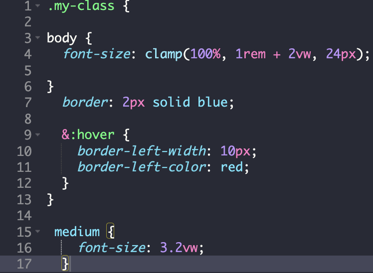
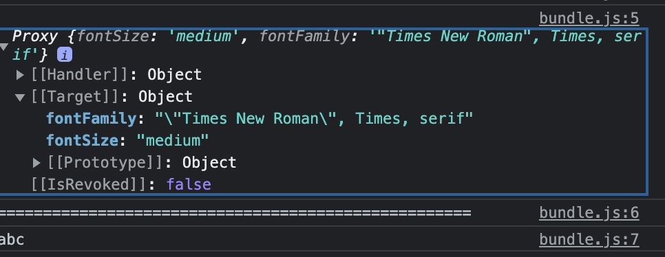
I defined ‘medium’ as 3.2vw using an extension and set size as ‘medium’ in the Typography font size.
I confirmed that the font size had been assigned to the text by reading style for the component, but on render, the text does not adjust in size based on the viewport.
Full disclosure, I started programming when a "c: was all you had to create code. I then went off to run the family business (which had nothing to do with code - more booze & food), and now I’m living the dream with your fantastic no-code platform.
Everything else that has been developed (re: software development) between these points in time is unknown to me, and unless I really need to know about them, I will rely on Backendless UI logic workarounds such as it was back in the day.
App ID - 45F4AD7D-0C9A-4A6A-FF23-2666FDC93000
working on page ‘testStyle’
‘medium’ font size define in extension ‘testStyle’
Thanks in advance,
Paul
Hi @Paul_HIllen
There are a few points which do not look correct from the CSS perspective:
- you need to keep CSS selectors hierarchies when you specify
.my-classand thenbodyin it, it means these styles will be applied forbodyHTML tags which are located inside an element with the.my-class. mediumin the CSS is just a pointer to a tag with the name “medium” like “div/span/button/…”
here is a few links which can be helpful for you
My colleague @Dima just shared a sample which has to solve your issue:
.my-class {
  font-size: 40px;
}

/* On screens that are 992px or less, set the font-size to 30px */
@media screen and (max-width: 992px) {
  .my-class {
    font-size: 30px;
  }
}

/* On screens that are 600px or less, set the font-size to 12px */
@media screen and (max-width: 600px) {
  .my-class {
    font-size: 12px;
  }
}
Regards,
Vlad
Thanks @Dima & @vladimir-upirov. I’ll still read the links sent, but it’s good to have something which works to allow more practice.
All the very best,
Paul