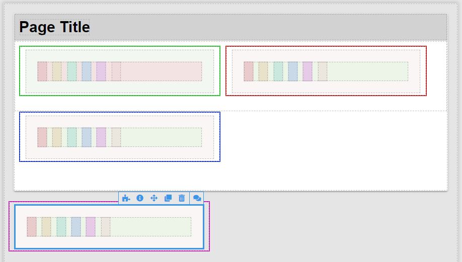
Cells in containers expand (unexpectedly) as web page width is reduced.
This test UI has four containers; the components have borders or background color so changes can be seen (only the cell widths change).
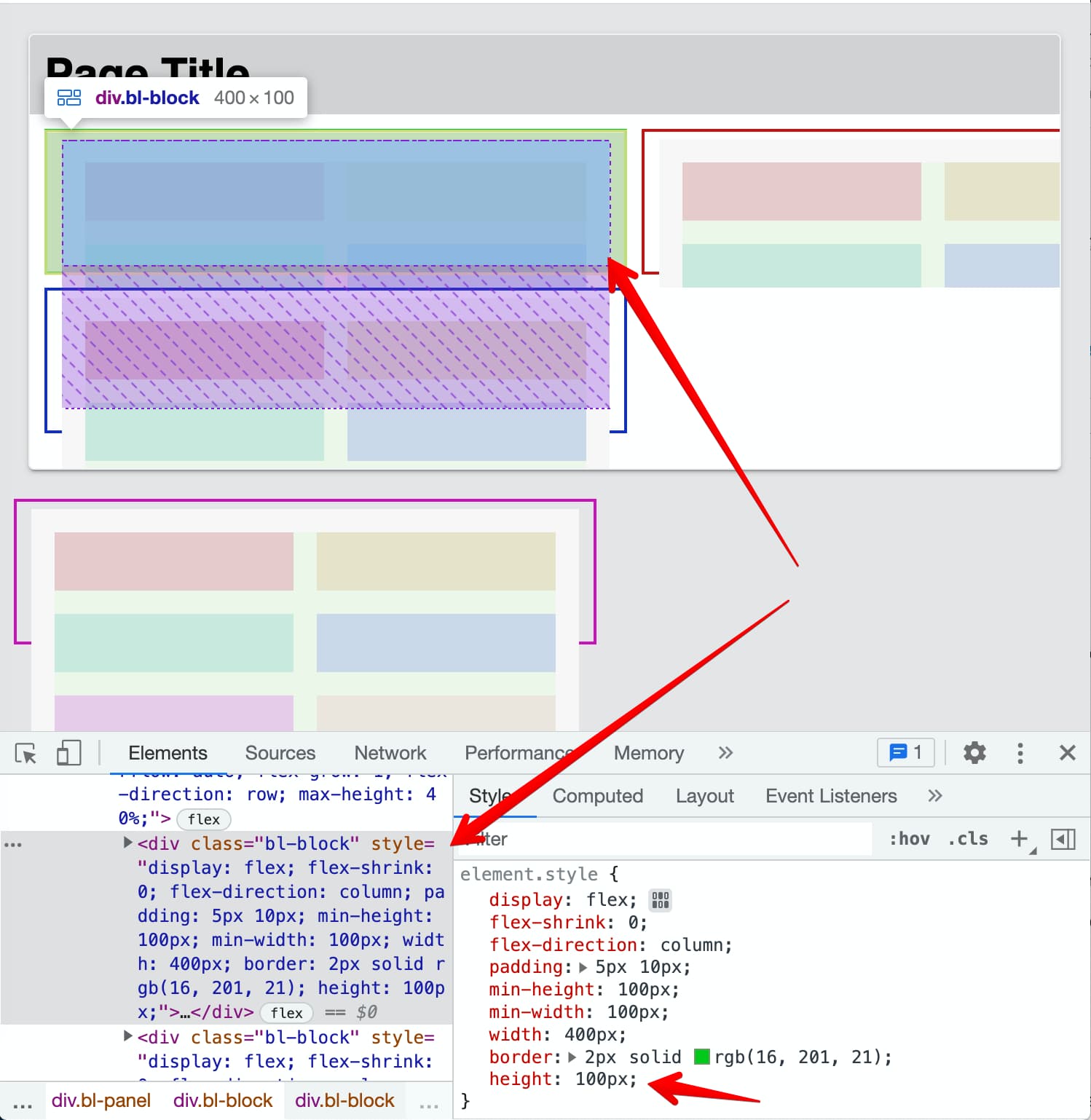
UI Builder
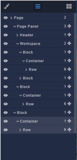
Component tree (two containers in block in Workspace block, one container in Workspace block, one container in page Panel). Rows not expanded as have only the six cells.
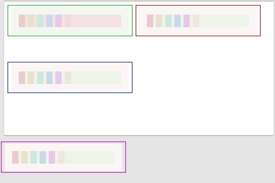
Preview 1
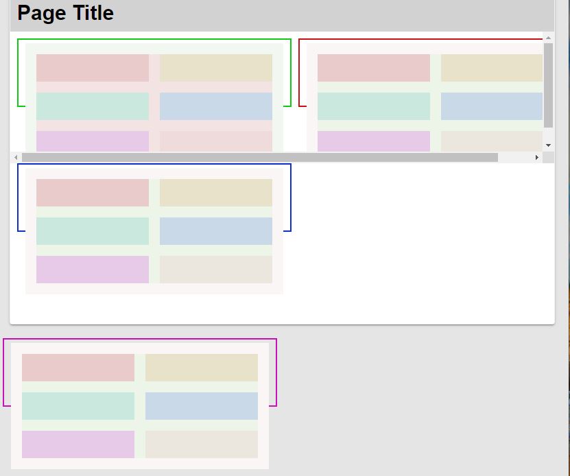
Preview 2 – web page width slightly reduced
(Unexpected) Cell expansion is the same for all four containers. I thought component dimensions were affected by the (immediate) parent; these cells all have different parents but expand (to 50%?) based on the web page width. (Note UI Builder exhibits the same behavior).
What causes the cells to expand?
Hello @Jim_Austin
There can be many reasons for such behaviour, I would start by checking height/max-height for the cell components.
Could you please share a link to the page preview?
Regards, Vlad
What would I be “checking” for? I don’t see what cell height has to do with cells widening when the web page width is reduced?
Setting the six cell heights in the first container to auto caused the cell heights to reduce slightly, but same unexpected widening.
Link to page preview:
https://safewash.backendless.app/api/files/ui-builder/containers/test/index.html?page=ContainerTest
You’ve got a block that has height:100px
-
What does any component that has a height setting have to do with “cells widening when the web page width is reduced?”
-
Preview now has a fifth container, not in a block: https://safewash.backendless.app/api/files/ui-builder/containers/test/index.html?page=ContainerTest
Note that the behavior is exactly the same.
Oh, I see
You use Container/Row/Cell components which are sensitive to the current workspace size (there are three icons Desktop/Tablet/Mobile in the top-left corner next to the current page menu)
You specified 1/12 for desktop but didn’t for mobile and tablet, could you please check this
Regards, Vlad
You are correct Vlad: setting the cell width to 1/12 in the Tablet and Mobile workspace UIs (to match the Desktop setting) eliminates the unexpected cell widening described above. I’m setting this post to ‘Solution’ as it clearly describes the ‘fix’ you figured out.
I assume this is a bug: the same code is (should be) displayed in all three workspaces (cells deleted in Mobile are gone from Desktop), but this topic shows the components settings are not the same. I work with the Desktop UI; never occurred to me that settings in the other two UIs would affect how Desktop renders the component images.
Are there other ‘gotchas’ like this?
I don’t believe that it’s a bug, as there are many other UI apps that behave the same, such as Elementor. The three views are separated so that one can more easily customize an app to different display sizes. UI Builder defaults to repeating 4, 8, and 12 cells per row for the different screens.
Roger
1 Like