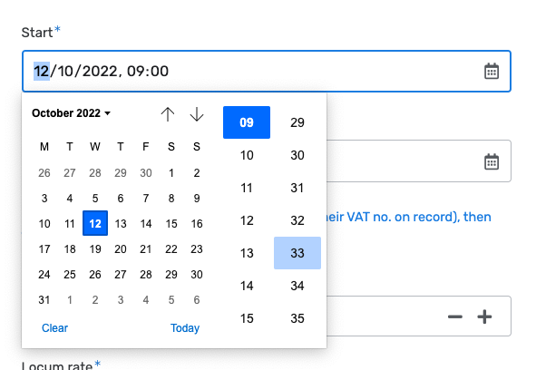
The date time picker used for the date fields is really not a conventional look, and I have received several complaints about this being hard to use and navigate from users.
Is it possible to get the time picker especially to be «more normal»?
The date time picker used for the date fields is really not a conventional look, and I have received several complaints about this being hard to use and navigate from users.
Is it possible to get the time picker especially to be «more normal»?
Everything is possible! Especially since you can create your own custom UI component (and share it with the rest of the community…)
However, I am curious about how you would describe “more normal”. Here’s ours for reference:
I find the date part very standard, but time part is where it’s less usual. Especially when I found that manual entering of the time isn’t possible.
I quite like the one in App Sheet, where the date time can also be typed directly into the input box.

Hi @Bob_Leung
You can build your own custom UI Component using any 3rd party library
take a look at the article, although it was published a year ago you can get there the main idea of building your components
in addition, you can see how we build components for our marketplace
Regards,
Vlad
As @Bob_Leung said, it is the time component that is strange! The calendar is straight forward, but the analog «wheel of time» thing is not something that users are familiar with, on any surface.
I think it would be great to have a more common approach, like the one Bob showed, be part of the standard elements. Date/Time selectors are pretty basic, and even though I understand I can create a custom object for this, it seems a bit like spending time straightening nails instead of focusing on actually building the house…
Sounds like @Egil_Helland thinks that our team doesn’t have a house to build…
![]()
I was thinking more of the small hut I am building, to be honest…
![]()
![]()
And no offense meant at all!