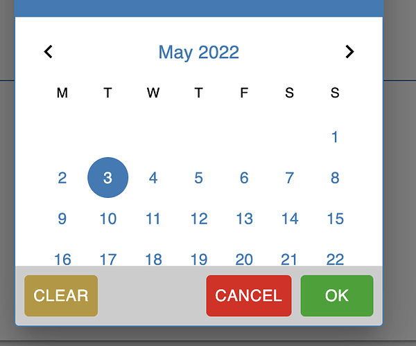
It would be very useful to be able to constrain the input to only dates in the future, or dates in the past, depending on the use case. For example I use it for the user to set a reminder, and a reminder has no use if set in the past
I also haven’t found a way to independently change the style of the Reset, Cancel and OK button. They all seem to have the same classes. Is there a way to either attribute different classes to one or the other, or alternatively to change their color independently ? (for example Cancel in Red and OK in green).
It would be very useful to be able to constrain the input to only dates in the future, or dates in the past, depending on the use case. For example I use it for the user to set a reminder, and a reminder has no use if set in the past
We already have a ticket for that: BKNDLSS-26534
I also haven’t found a way to independently change the style of the Reset, Cancel and OK button. They all seem to have the same classes. Is there a way to either attribute different classes to one or the other, or alternatively to change their color independently ? (for example Cancel in Red and OK in green).
Yes, at this moment there are no specific classes for these buttons, but you can use the following styles to change colors based on their position number
Just a quick follow-up regarding the ticket for localizing the date picker : users are drawing my attention to the fact that it is in English only.
So I am wondering : except if this is coming very soon, otherwise could you perhaps suggest how I could duplicate the component to translate it ? Then when the official datepicker is localized I could shift back.
I was wondering where your internal tickets BKNDLSS-28225 and BKNDLSS-26534 stand ?
Date localization is quite a subject with users.
Thanks for your feedback.
Loving the datetime picker… but would like to trigger it programmatically (so instead of user clicking directly on it, user clicks on some other component somewhere else and the datetime picker should behave as if it had been clicked to open the calendar picker. Per chance is there some value or event in the component I can access with Codeless?
Hi @Alexander_Pavelko thanks for the quick reply… so there is no “state” in the component where it’s activated and it could be set to “active”? We’ll work around it but do let me know if/when additional functionality is added, thank you again
The component has a state, but it is under the hood.
I’ve created ticket BKNDLSS-30702 to discuss this possibility, we’ll let you know the results of our discussion as soon as possible.
Things have not changed on this component in two years. Yet selecting a date is quite a critical component in many applications. Wondering what the plans are.
More datetime picker questions and/or requests here (should I open a new ticket?):
We want to build a booking service where people can book an appointment with a provider. But the provider is not available every day of the month… is there a way to disable some days, but not others, on the calendar interface? Right now it’s easy to set minimum or maximum date (so all days before or after are disabled). Would be awesome if we could feed an array of numbers to the component which would disable or enable different days of the month. Perhaps this is already possible? If not, any suggestions for how to proceed? We don’t want users clicking a day only to find out that there are no available times on that day…
We have just updated our cloud servers to fix one of the issues you described.
User Interface - Settings:
Set Locale for a specific component from select, has one of the values - “Default”, in this case, the value from the globally selected language will be taken for all DateTime Picker components (Settings → UI components)
Logic - On Locale Change:
Manages the Locale of a specific component, takes a value as a string, available Locale - link, a string parser function has also been added if the user entered a non-existent Locale, for example, “es-ca”, the function will set the language closest to this → “es” if the function does not find a match, the default “en” will be set.
Settings → UI components:
Set for all DateTime Picker components as a default value, one of the values “Auto” - in this case, the Locale of the client who visits the site will be read and set by the language for DateTime Picker in case the Locale does not come with Logic(Handler) or User Interface - Settings