Here’s something that might be a nice quality of life improvement and be very easy to implement.
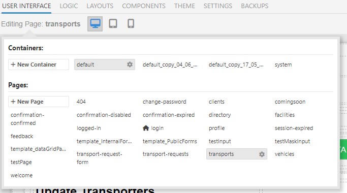
Right now, when you hover over “Editing Page” you get this interface:

However, if you’re in logic or another tab and need to get to another page, you have to click “User Interface” first, and then click into the “Editing Page” window. This comes with a UI load time as well. I think if you extended the clickbox for the “Editing Page” interface hover effect to also include the “User Interface” tab header itself it could make it a lot easier to (a) open the interface when you’re not already in the User Interface tab, and (b) make it more reliable and easier to open the interface when you are on that tab.
Just food for thought!