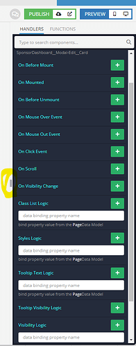
I’m not sure what this panel is called, but it would be awesome if you could drag the width wider -
If you have long component names, you have to constantly scroll back and forth to be able to see the name, then expand, then see the name. I’ve been changing the CSS in the browser to make the width wider, but it seems like it would be an easy improvement. I can’t be the only one that struggles with this.
In the logic section, the right panel is width draggable -
Thanks,
Tim

