Question (or perhaps bug report) about block components and flexbox: we have a block with flex direction “down” and wrap set to “wrap”. Hoping to be able to basically go from 2 columns (desktop view) to 1 column (mobile view), but the parent block is not adjusting it’s width so when content is located in a second column, the parent block doesn’t expand and the content is cut off. Here’s a screenshot:
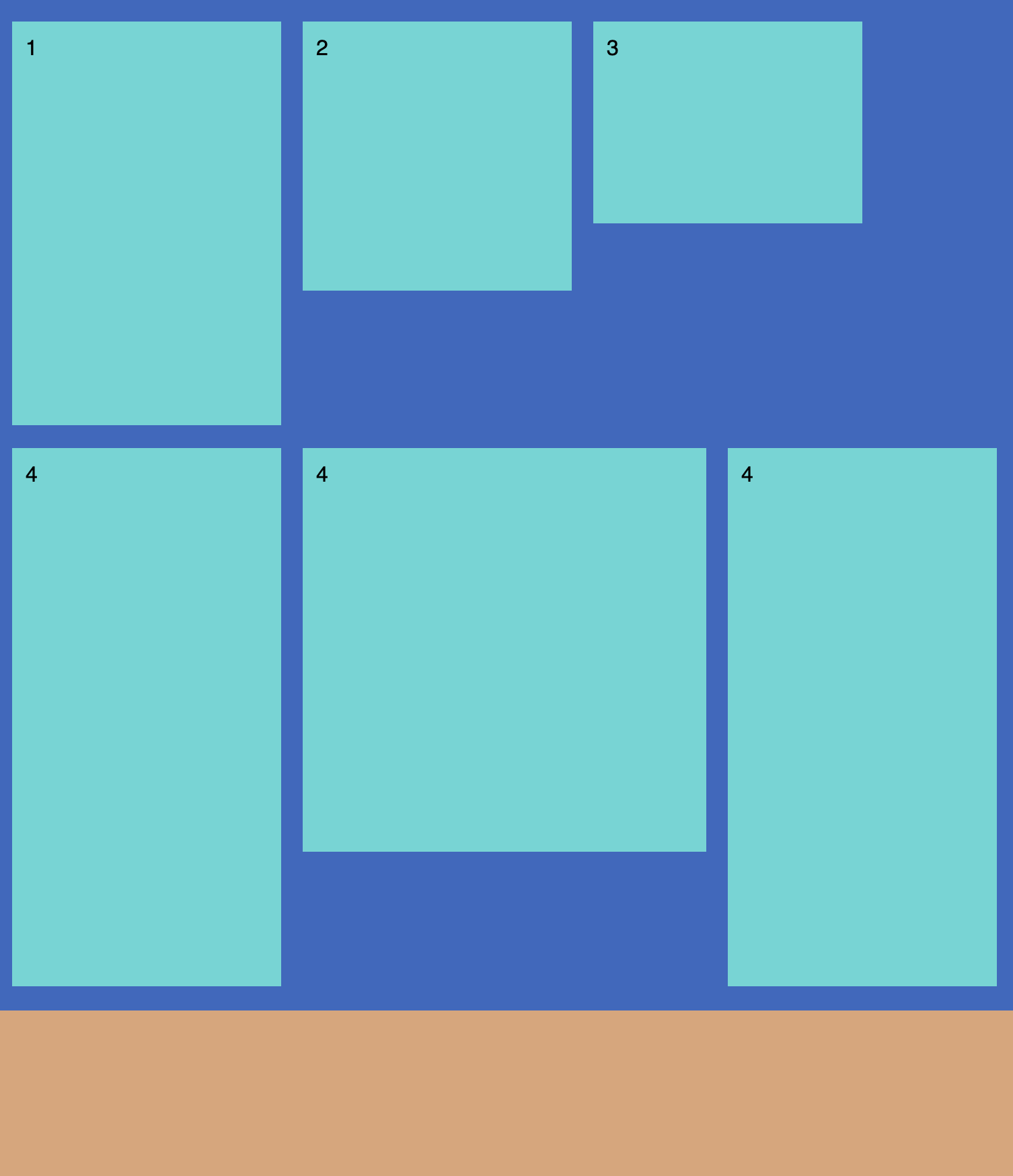
Note: wrap set to wrap-reverse to be able to show a nice screenshot. As you can see, items 3 & 4 are successfully wrapped, but the parent container doesn’t increase it’s width to accommodate the second column. How can we get 2 columns on desktop?
Could you please attach a screenshot showing the desktop view layout and what you get with the mobile view? It would help us understand the scope of the issue better.
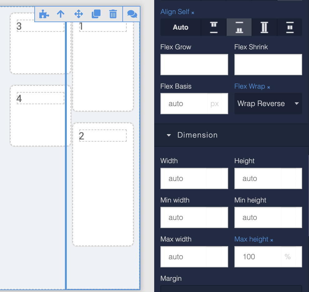
The desktop and mobile views produce the same results, attaching the desktop view below. As you can see, the parent block has max height = 100%, max width set to something large that should be able to accommodate two columns of the child elements.
When Flex Wrap is set to “no wrap”, the children in the parent container are arranged vertically and we can scroll down to see all of them. When Flex Wrap is set to “wrap”, the children are wrapped (i.e. they start a new column — good, working as expected)… but the parent container does not expand its width to contain both columns.
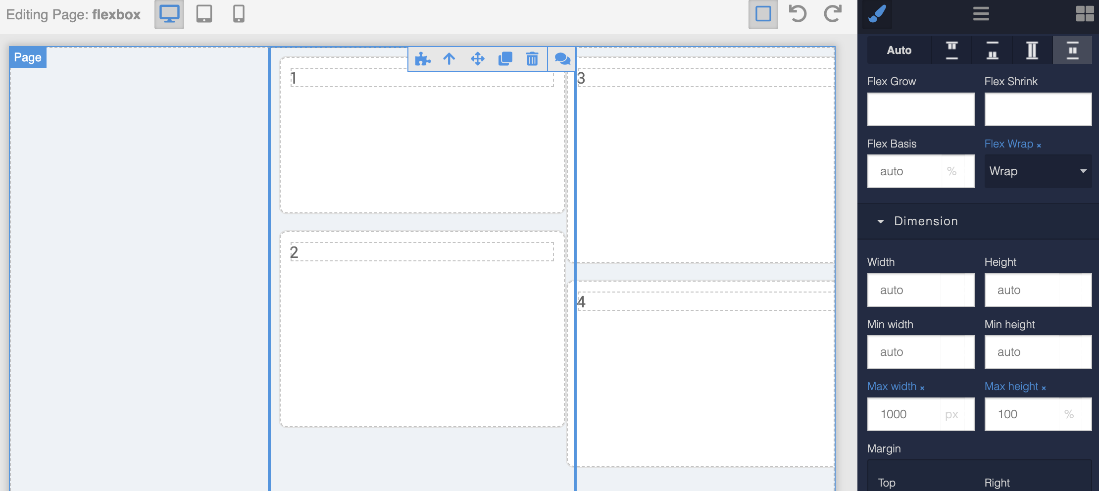
I guess I am struggling to understand what you mean by “parent container”. Is the container that has a height of 100% and flex-wrap settings? Or is there another container? Additionally, what confuses me is the screenshot shows a block with 1 and 2 children. What do 3 and 4 have to do with it? Are they part of the question?.. Just trying to wrap (no pun intended) this in my mind.
Hello @Alex_Klein
it’s not obvious to me why the parent block doesn’t expand. But that’s how CSS work. Can you explain what behavior you expect? I am trying to find another way
Hi Viktor, I would expect a similar kind of behavior one gets when the parent container is set to arrange its content “left-to-right”: the parent container grows (vertically) to accommodate all items inside as they wrap and create new rows.
So it should be exactly the same kind of thing but rotated 90 degrees: the parent container should grow (in width, horizontally) to accommodate all items inside as they wrap and create new columns. Hope this makes sense?
If this is an issue with Flexbox (not Backendless), maybe you will have an idea for how we can achieve our desired layout: we have content in two columns for desktop view, which should become just one column in mobile view. Seems very straightforward… right? But we don’t want items to be arranged in rows like they are in the “Container” element, because the row height is set by the tallest item, which results in ugly gaps. We want the same gap width/height for all items. Here’s a drawing:
@Alex_Klein
What should be the behavior of children?
Is height constant or dynamic (depends on content size)?
Is width constant or dynamic (depends on content size)?
Is the order of children important?
Could it be like:
12
34
Or it must be only like:
13
24
Our children have dynamic height, but constant width (well, 100% with a max). All the children are the same in this regard.
The order of children is not very important but it would be a “nice to have” (where we can assign order property to each child).
Can you tell me if the failure of the parent container to expand (width) is normal expected behavior of Flexbox, or something unique to the Backendless UI Builder?
Thanks for making the video — what you are showing is for a parent container that is set to arrange content “left to right”. There, the parent container grows in height to accommodate all the children as they wrap and form additional rows.
Our challenge is to get the same thing happening when a parent container is set to arrange content “top to bottom”. Basically, exactly what you showed but looked at sideways by tilting your head 90 degrees.
Thank you for the video. What I am trying to understand is this:
If the container is configured to go top-to-bottom and the children are already positioned in a column. What would “wrapping” be accomplishing? The top-top-bottom layout is already in action and all the children are initially positioned according to that policy.
@Alex_Klein
This is an unfinished model. Just a sketch to understand what you want.
What do you expect for 20 children in desktop view?
Is the blue block has max-width or it must be constant?
Should the children line up in no more than two columns?
@viktor.liablin yes, the dark blue block (parent) has max width. So in desktop view, we will never get more than 2 columns (because the children have a min width), while in mobile and small tablets we get just one column (again because the children have a min width). I would imagine this is a very common pattern but apparently it’s a little tricky to implement — I really am impressed by and appreciate the Backendless Team efforts to helps us figure it out
Oh and to answer your question: if there are lot of children, user will have to scroll down to see all of them.
if there are lot of children, user will have to scroll down to see all of them.
But for pattern:
1 4
2 5
3
Look like scroll down is impossible
Because we and CSS do not understand when to put the “4” child to the top.
But I think it is possible with horizontal scroll
Hm, I see what you mean about “when to put the 4 child on top”. I didn’t consider that, I can see that this is why “vertical” is different from “horizontal”. Perhaps it’s possible if we define the max height of the parent container for desktop view (so making the wrap happen when children reach the bottom, putting the 4 child on top), but then define a different height for the parent in mobile view (so that all children can fit on top of each other)?
For mobile view, I don’t see any problem. I wouldn’t think about it just yet.
Putting the “4” child when the “3” reaches the bottom is not a problem. But what should we do when the space on the right runs out?
For example, we have space only for 3x3:
1 4 7
2 5 8
3 6 9
What to do with 10?
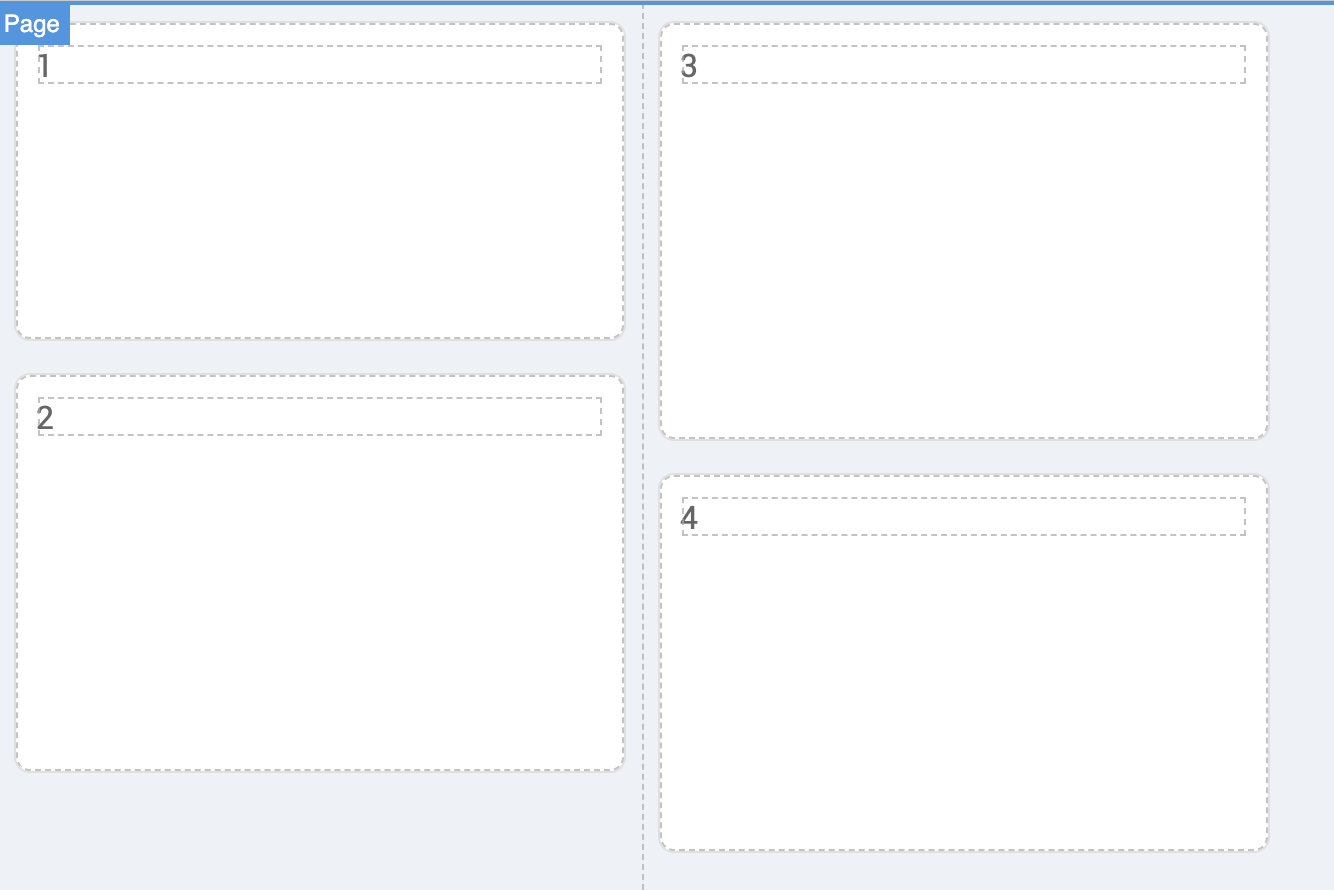
 yes all the elements 1-4 are inside the block I call “parent”, which has height 100% and flex-wrap settings. It’s the one selected in the screen shot.
 — I really am impressed by and appreciate the Backendless Team efforts to helps us figure it out