I’ve got a bit of weird issue that makes me think I am trying to do something that isn’t allowed. I am pretty new to front-end anything.
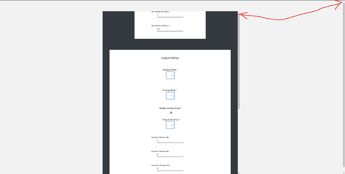
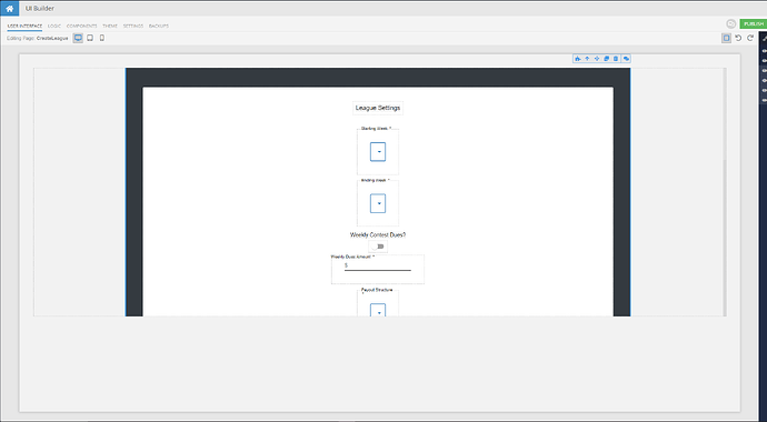
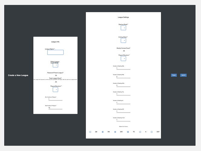
I have a form on my page, and within the form I have two panels and a block. When I view the form, and even in the UI Builder, I can only see the second panel and the block - the start of the form and the first panel are totally off screen.
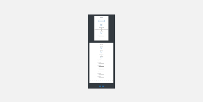
If I zoom out to 33%, I can see the entire form.
I tried enable overflow scrolling several different ways, but in the images shown I have it enabled on the page, and you can see scrolled all the way up the form is still cutoff.

Placing the form inside of containers and blocks and setting the overflow to scroll there doesn’t work either.
Any ideas?
Thanks!
Hi Jon,
Welcome to the Backendless community!
Could you please let us know your application ID and the name of the page where you encounter the issue?
Regards,
Mark
1 Like
Sure!
1CAF948E-15B7-3967-FFD7-8E03E05BFC00
It can be seen in the container ‘v2’ - pages ‘CreateLeague’ and ‘CreateLeagueV2’
The difference between the pages are one attempts to present the form in a container while the other in a block.
I am looking at the pages and am struggling to understand what you’re after  Is the goal to display it as shown below? (this is what I get when I zoom out the browser to 30%):
 I expected this page, 1 container to have the grid layout - and I added 4 rows with 1 cells, which takes up the entire width of the row - and that’s what I got. I wanted each row to appear vertically ontop of the other.
The ‘CreateLeagueV2’ page renders more closely to how I expect it to look (vertically stacked)
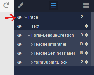
I am quite puzzled by what I see here. The page’s properties appear to be overridden where it acts like a Block. I do not see any custom styles, yet, the page does not act like a regular UI Builder page. How did you override the default configuration of a page?
Well that makes me feel a bit better then, that’s what I thought was happening. There are a few other weird things that got me here -
My v1 app, I hadn’t worked on in quite some time. When I picked it up recently, I noticed all the UI’s looked very odd like this - so I cut a version in ‘v2’ and started to rebuild the pages. I got lazy w/ this form, and didn’t want to redo it, so to try and save time I copied and pasted the files for the pages in v1 container into my v2 container. I pulled in all of my custom components as well, though I deleted most of them as they were me teaching myself how they worked and were not built properly.
After I did this, it caused the weird UIs to show up in V2 as well - causing containers to behave like blocks. I tired a few different iterations cloning the pages, rebuilding them in various ways, etc before reverting it back to its current state and calling for help.
So my top two guesses are:
- v1 container is using deprecated things (not sure if thats possible w/ backendless) or
- when I copied from one container to another, I did something wrong
Just as a test - I created a CreateLeagueV3 page, but this time I created it from a blank page. Things are back to working as normal it appears to me. (though I have styling issues, scrolling is working as expected)
Previously, I was choosing “from another page” and choosing the old CreateLeague page that had the form in it - this must be the difference.
Hi @Jon_Casstevens
I just investigated the v2 container and found what exactly breaks the page layout.
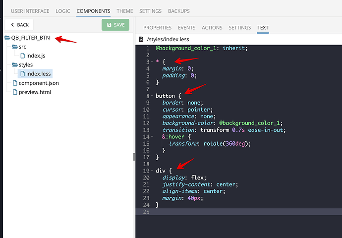
There are many custom components, and at least one of them assigns styles to the basic DOM elements which affect all the pages.
Custom Components Styles doesn’t have its own scope because the component can create DOM elements on the top HTML level, for instance, it could be a Dialog which has to be over all the elements. So it means you need to carry on CSS selectors collision, the best way is to create a unique CSS class name of the custom component and then use it as a scope in the styles.
Regards,
Vlad
Aha, got it - thank you! That makes good sense. I appreciate the help Vlad & Mark 
