Hi
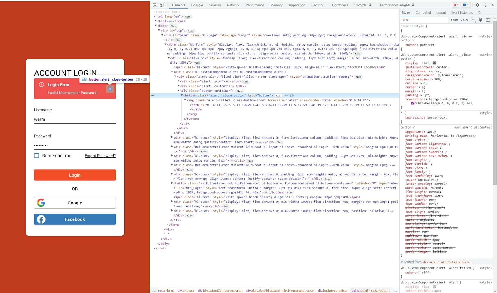
When using the Alert Component is there any way of getting the hand pointer to show when hovering over the close icon instead of the arrow pointer? See the image below.
Hi
When using the Alert Component is there any way of getting the hand pointer to show when hovering over the close icon instead of the arrow pointer? See the image below.
Hello @Glenn_D
Need some CSS here.
Add class “my-class” to the cross icon.
Go to sections “themes” → “EXTENSIONS” → add new (or use existing)
CSS:
.my-class {
 cursor: pointer;
}
Regards
Hi @viktor.liablin,
Thanks for the reply. The cross icon is part of the Marketplace Alert Component. I’m not sure if I can add a class specifically to the cross icon in this case. Am I missing something?
Thank you.
Thank you very much for the answer. I would like to be able to find these classes to be able to make small changes/tweaks to the UI myself. Can you tell me what the best way is to find the CCS classes for the different elements on a page or within a component? Is there a way to break things down and easily see the correlation between elements on a page and parent->child relationship of classes. Happy to see a tutorial on this if you know one exists.
Thank you
Should do more research before I ask the question  . I suppose this is the way:
Any other advice you may have… happy to hear it.
Thanks again.
Glenn
Hello @Glenn_D
Yeah, this is the way.
Sometimes you need to change the CSS styles, and sometimes you need to add.
In the case of “pointer,” you added.
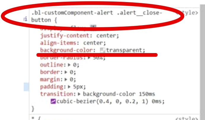
You find an element you want (the button) and add style.
I took the element root class “bl-customComponent-alert” and the button element class “alert__close-button” to indicate the target for style.
Sometimes you want to change the CSS styles. Example “background-color” of the button. Now it is “transparent” but you want to change it to “red”. If it is not your style you must override it. The target of “background-color”: “transparent” is:
.bl-customComponent-alert .alert__close-button { ...
so you can try overriding it like:
.bl-customComponent-alert .alert__close-button {
  background-color: red;
}
To better understand the styling process, you can study CSS
Regards