A hamburger menu is a common UI element, particularly for mobile and tablet design. Hamburger menus allow the user to easily show and hide a site or application’s main navigation menu to preserve screen real estate.
In this article, we will walk you through the basic steps for setting up a simple hamburger menu in UI Builder. You will see, step-by-step, how to create your own hamburger menu.
We will also walk through how to optimize the menu to be responsive; that is, make it only appear on mobile and tablet views.
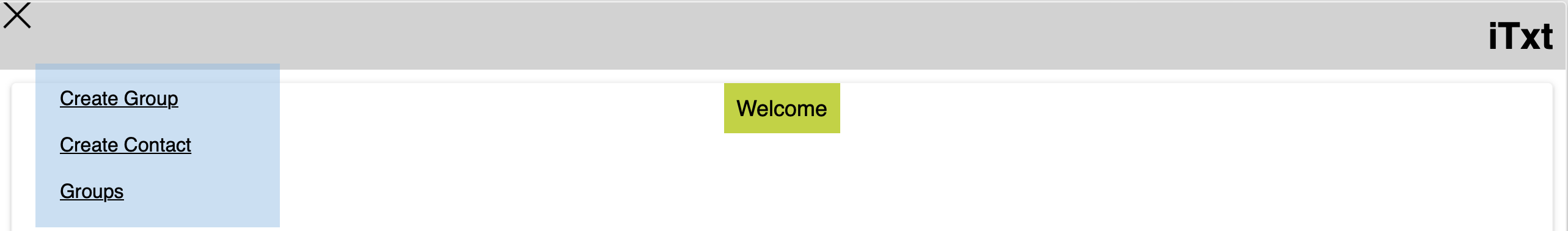
Check out a demo of the hamburger menu we will be building.
To get started, you must have a Backendless account. You can sign up for free here.
Hamburger Menu Structure
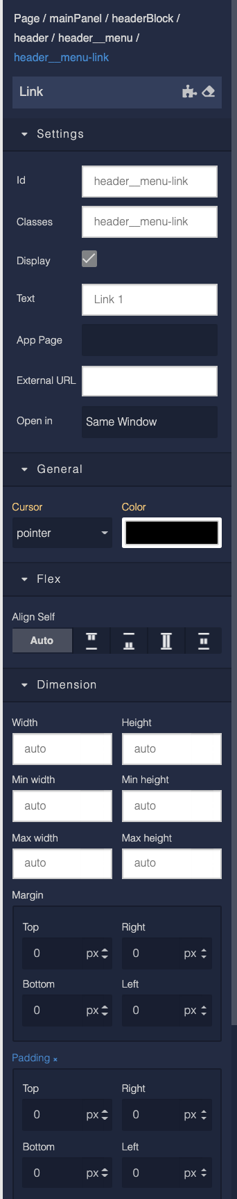
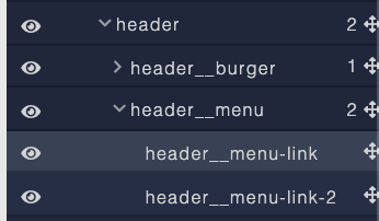
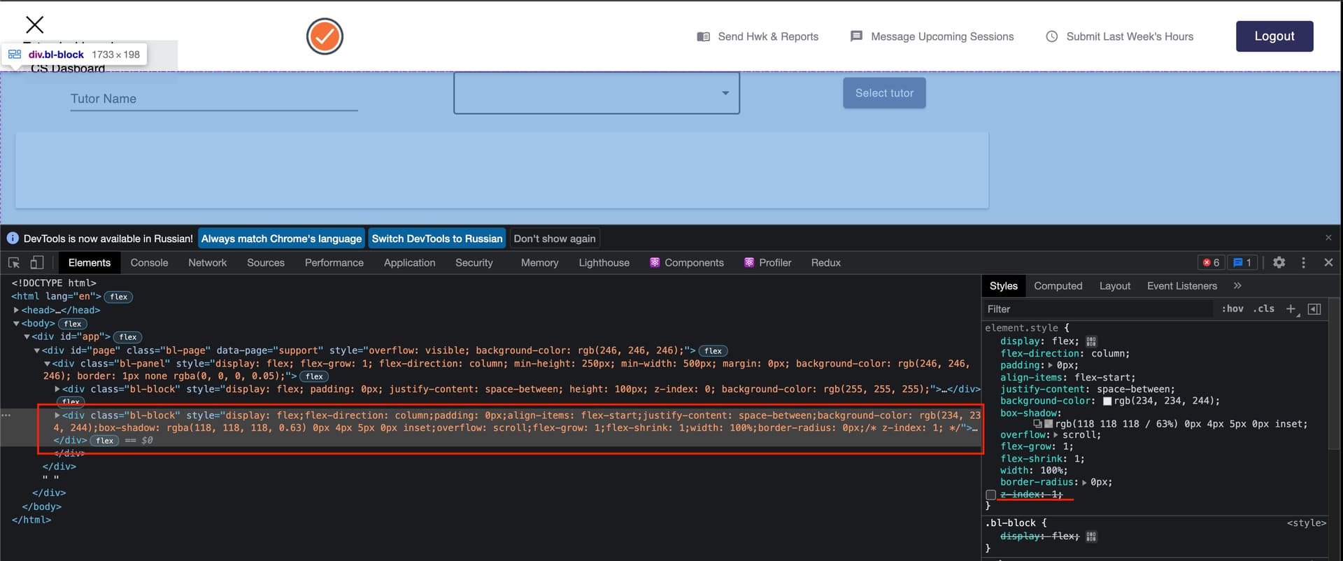
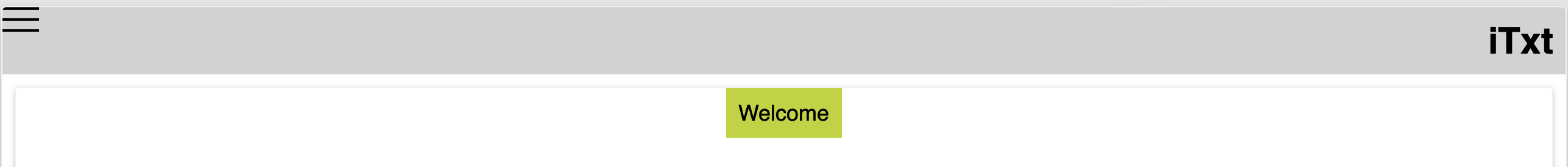
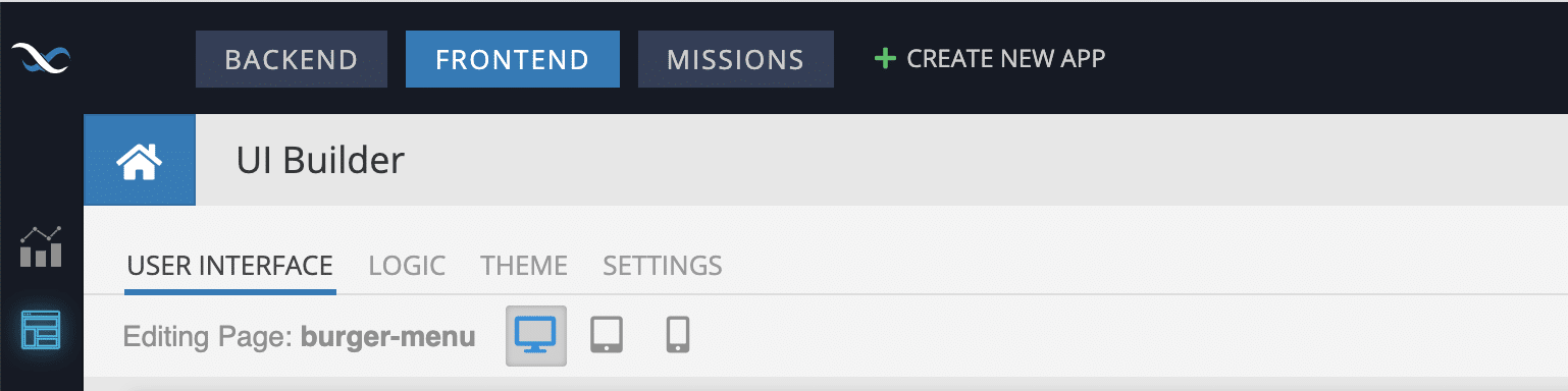
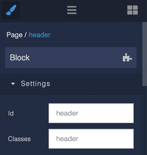
Let’s start building a hamburger menu by creating a component structure on the User Interface tab.
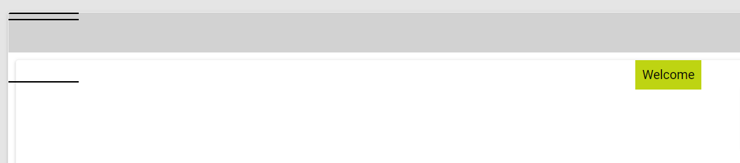
The general structure of the component is shown below. For clarity, element IDs are named the same as classes. Each ID must be given a unique name.
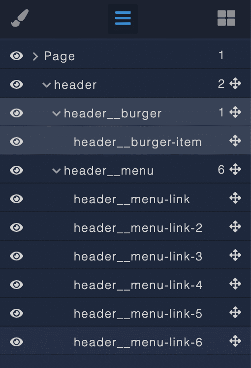
As a result, we will get a scheme like this (note: in the screenshot, the styles described below have already been applied):

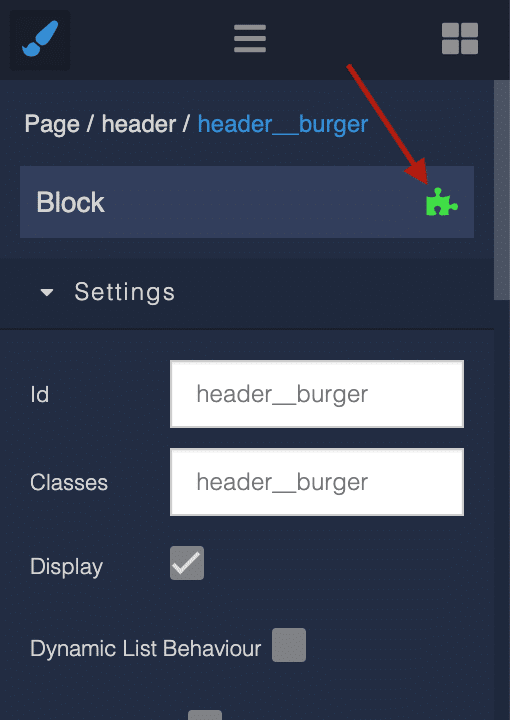
For header, header__burger, and header__menu, we will use the Block component.
Use the Text component for header__burger-item.

Use the Link component for each header__menu-link.
After adding content to our Block, let’s reset the styles using blue crosses.
Also, when adding elements, be sure to specify its ID and class.
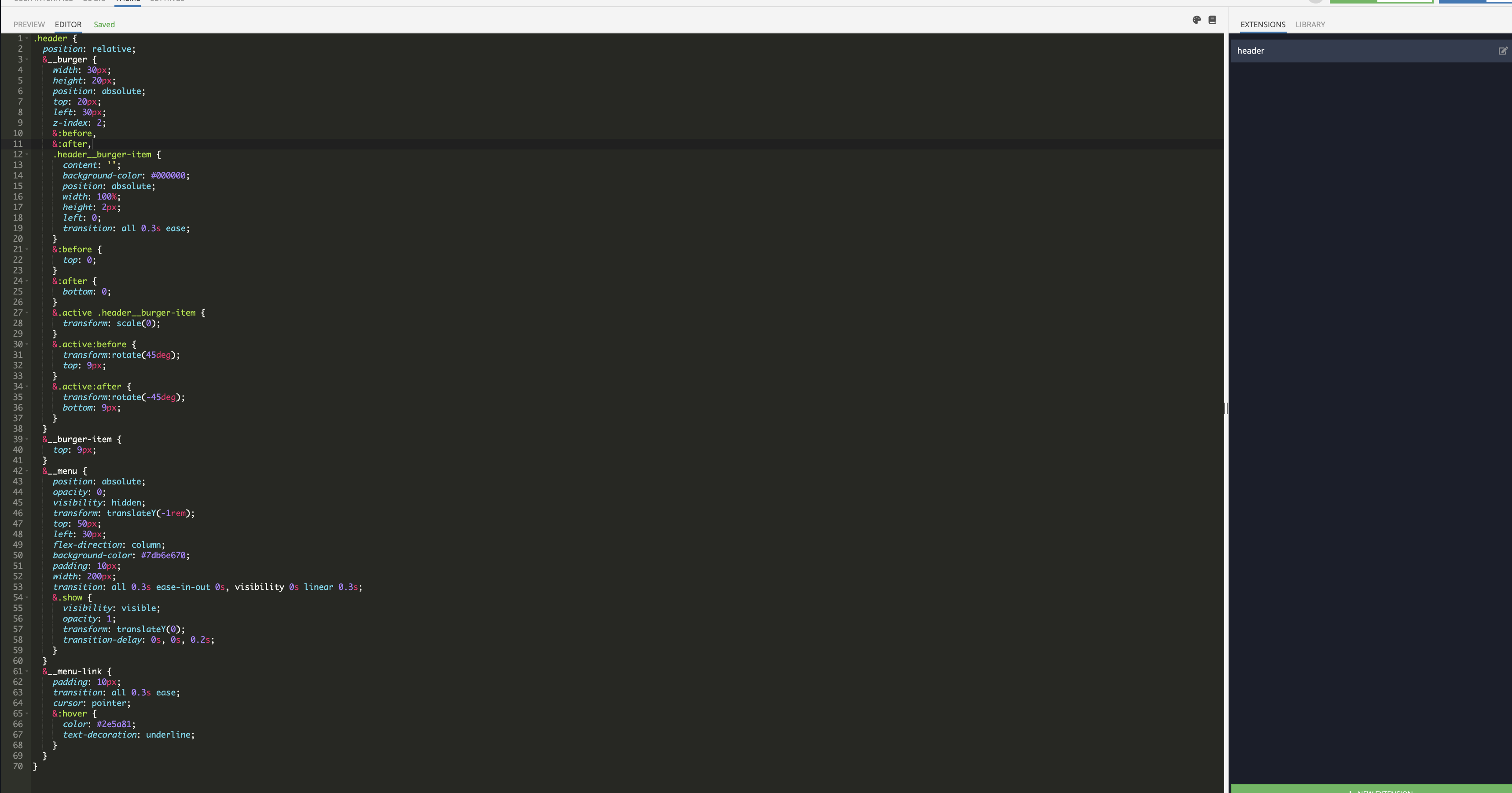
Styles
To create styles, switch to the Theme tab. Inside the page, select the Editor and Extensions tabs.

Create an Extension. We recommend you name the extension according to the component name for convenience.
The following code is written using CSS LESS.
.header {
  position: relative;
  &__burger {
    width: 30px;
    height: 20px;
    position: absolute;
    top: 20px;
    left: 30px;
    z-index: 2;
    &:before,
    &:after,
    .header__burger-item {
      content: '';
      background-color: #000000;
      position: absolute;
      width: 100%;
      height: 2px;
      left: 0;
      transition: all 0.3s ease;
    }
    &:before {
      top: 0;
    }
    &:after {
      bottom: 0;
    }
    &.active .header__burger-item {
      transform: scale(0);
    }
    &.active:before {
      transform:rotate(45deg);
      top: 9px;
    }
    &.active:after {
      transform:rotate(-45deg);
      bottom: 9px;
    }
  }
  &__burger-item {
    top: 9px;
  }
  &__menu {
    position: absolute;
    opacity: 0;
    visibility: hidden;
    transform: translateY(-1rem);
    top: 50px;
    left: 30px;
    flex-direction: column;
    background-color: #7db6e670;
    padding: 10px;
    width: 200px;
    transition: all 0.3s ease-in-out 0s, visibility 0s linear 0.3s;
    &.show {
      visibility: visible;
      opacity: 1;
      transform: translateY(0);
      transition-delay: 0s, 0s, 0.2s;
    }
  }
  &__menu-link {
    padding: 10px;
    transition: all 0.3s ease;
    cursor: pointer;
    &:hover {
      color: #2e5a81;
      text-decoration: underline;
    }
  }
}
Responsive
If you want to use this menu only on tablets and mobile devices, you need to add the visibility of elements by breakpoints:
.header {
  position: relative;
  &__burger {
    width: 30px;
    height: 20px;
    position: absolute;
    top: 20px;
    left: 30px;
    z-index: 2;
    @media (min-width: 768px) {
      width: 0px;
      height: 0px;
    }
  }
  &__menu {
    position: absolute;
    opacity: 0;
    visibility: hidden;
    transform: translateY(-1rem);
    top: 50px;
    left: 30px;
    flex-direction: column;
    background-color: #7db6e670;
    padding: 10px;
    width: 200px;
    transition: all 0.3s ease-in-out 0s, visibility 0s linear 0.3s;
    @media (min-width: 768px) {
      position: relative;
      flex-direction: row;
      visibility: visible;
      opacity: 1;
      transform: translateY(0);
      top: 0;
      left: 0;
      width: 100%;
      justify-content: space-between;
    }
  }
}
These breakpoints are written using the mobile-first method.
Logic
Next, we describe the logic for the appearance of the menu, and change the appearance of the hamburger – by clicking on the header__burger element.
To do this, click on the element, then on the puzzle icon.
Then add the Codeless logic for adding and removing element classes on click.
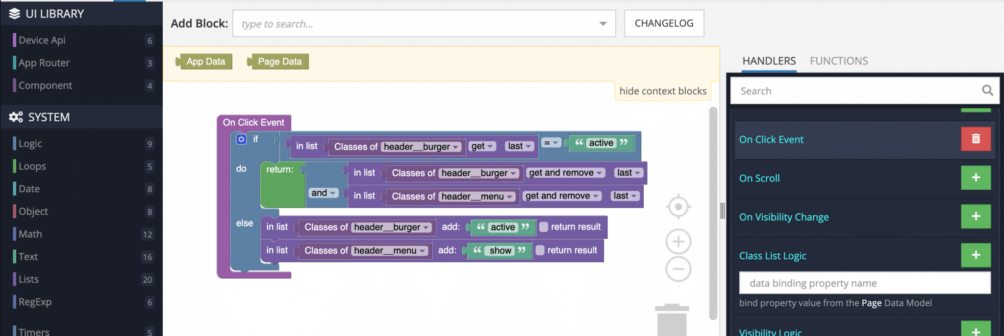
Let’s walk through what this logic is doing, in plain English.
- First, we have an “if” statement. The program looks at the classes for the element
header__burger. - If the assigned class is active, then the program performs the “do” portion of the if function. In that section, the program removes the class active, causing the
header__burgerandheader__menuto become inactive. - If the assigned class is not active, then the program performs the “else” portion of the if function. There, it adds the class active to both
header__burgerandheader__menu, making them both active.
Done! Now you know how to quickly and easily create a hamburger menu for your application using Backendless UI Builder.
Thanks for reading, and as always, happy codeless coding!