The tabs is a common UI element, it allows the user to switch content on the page.
This recipe describes how to implement it in UI Builder:
Structure
Let’s start building tabs by creating a component structure on the User Interface tab.
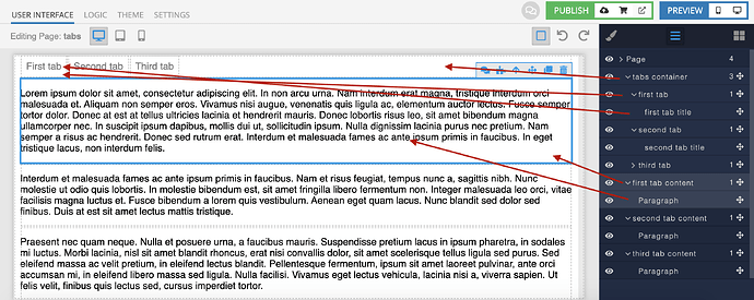
The general structure of the component is shown below. Each ID must be given a meaningful and unique name.
As a result, we will get a scheme like this (note : in the screenshot, the styles described below have already been applied):
For tabs container, all tab elements and all content elements , we will use the Block component.

Use the Text component for all tab title.

Use any component that suits you to fill the content blocks. Here we use the Paragraph component.

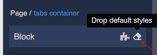
After adding content to our Block, let’s reset the styles using special button:
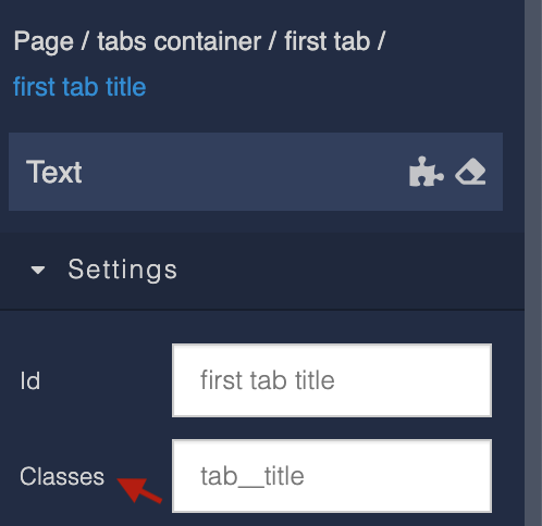
Also, when adding elements, be sure to specify its class.
Styles
To create styles, switch to the Theme tab. Inside the page, select the Editor and Extensions tabs.
Create an Extension. We recommend you name the extension according to the component name for convenience.
The following code is written using CSS LESS.
.container {
  align-items: center;
  margin: 0 10px;
}

.tab {
  position: relative;
  cursor: pointer;
  &::after {
    position: absolute;
    content: '';
    left: 0;
    bottom: -1px;
    height: 2px;
    width: 0%;
    transition: width .2s ease-in-out;
    background: transparent;
  }
  &.current {
    &::after {
      width: 100%;
      background: black;
    }
    & .tab__title {
      color: black;
    }
  }
  &__title {
    padding: 10px;
    color: grey;
    transition: color .2s ease-in-out;
  }
}

.content {
  margin: 0 10px;
}
Logic
At first, we need to set a flag with the name of the tab, which should be open when the user opens the page.
Click on Page, then on the puzzle icon.
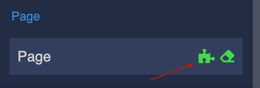
Find On Page Enter logic block and click on +.
We set property currentTab in Page Data with value - the name of your tab, it can be anything you like.
Then we create logic to set property currentTab by clicking on the tab element.
To do this, click on the tab element, then on the puzzle icon.
Find On Click logic block and click on +.
Then add the Class List Logic:
We create list of classes in dependence of the name of current tab.
Repeat these steps for all tabs, names of tabs must be different:
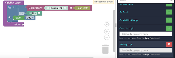
Next, we describe the logic for change the appearance of the content in dependence of currentTab value.
To do this, click on the tab content element, then on the puzzle icon.
Find Visibility Logic block and click on +.
Note: all the content elements option Display must be unchecked.
Done! Now you know how to quickly and easily create the tabs for your application using Backendless UI Builder.
