In the UI there is element such as dropdown that appear when you click on any element - text, picture or icon - it can be anything. Dropdown is great if you need to give a user options with very little space, it can be very small and can pack a lot of information in a small space.
This recipe describes how to implement it in UI Builder.
Structure
Let’s start building dropdown by creating a component structure on the User Interface tab.
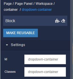
The general structure of the component is shown below. Each ID must be given a meaningful and unique name.
As a result, we will get a scheme like this (note : in the screenshot, the styles described below have already been applied):
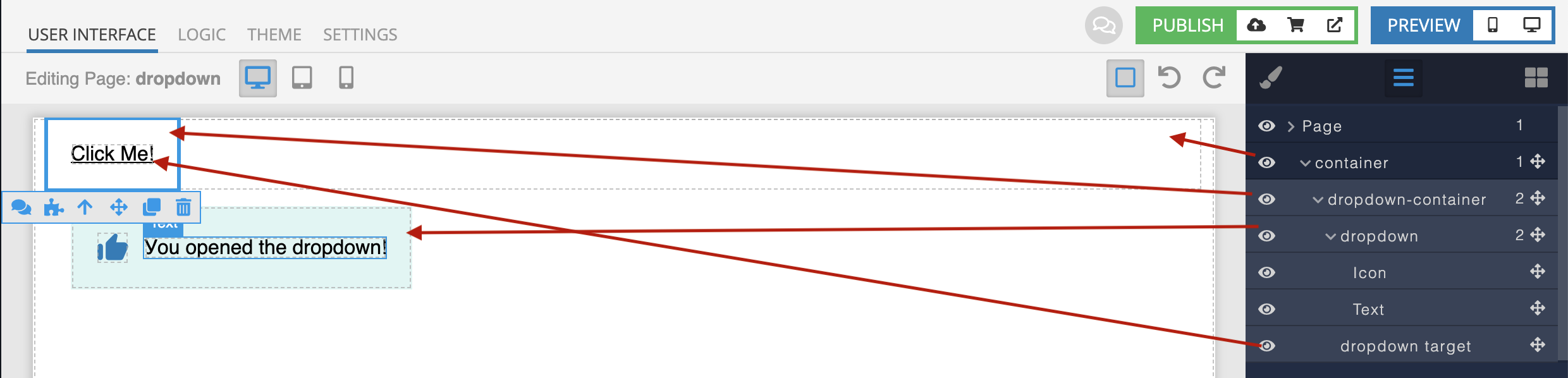
For container , dropdown-container and dropdown, we will use the Block component.
Use the Text component for dropdown target .
Use any component that suits you to fill the dropdown block.
After adding content to our Block, let’s reset the styles using special button:
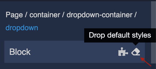
It’s better to do this for each element to avoid unnecessary inline styles.
Styles
To create styles switch to the Theme tab. Inside the page, select the Editor and Extensions tabs.
Create an Extension. We recommend you name the extension according to the component name for convenience.
The following code is written using CSS LESS.
.container {
  margin: 0 10px;
}

.dropdown-container {
  align-items: center;
  position: relative;
  padding: 20px;
  &__text {
    text-decoration: underline;
    cursor: pointer;
  }
}

.dropdown {
  position: absolute;
  visibility: hidden;
  opacity: 0;
  top: 70px;
  left: 20px;
  transition: all .3s ease-in-out;
  background: #e1f5f3;
  padding: 20px;
  box-shadow: 0 0 5px 2px rgb(0 0 0 / 5%);
  align-items: center;
  z-index: 2;
  width: 270px;
  justify-content: space-between;
  &.clicked {
    visibility: visible;
    top: 55px;
    opacity: 1;
    & ~ .dropdown-container__text {
      text-decoration: none;
    }
  }
  &::before {
    content: '';
    display: block;
    width: 10px;
    height: 10px;
    position: absolute;
    top: -10px;
    left: 0;
    border-left: 20px solid #e1f5f3;
    border-top: 10px solid transparent;
  }
}
Logic
Below we show the logic for the appearance of the dropdown by clicking on the dropdown target element.
To do this, click on the element, then on the puzzle icon.
Then add the Codeless logic for adding and removing element classes on click.
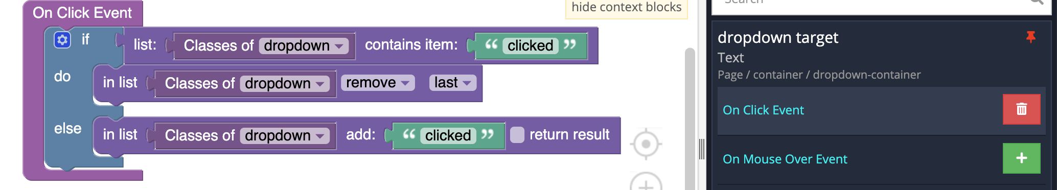
Let’s walk through what this logic is doing:
- First, we have an “if” statement. The program looks at the classes for the element
dropdown. - If the assigned class is clicked, then the program performs the “do” portion of the if function. In that section, the program removes the class clicked, causing the
dropdownto become inactive. - If the assigned class is not clicked, then the program performs the “else” portion of the if function. There, it adds the class clicked to
dropdown, making it visible.
Done! Now you know how to quickly and easily create a dropdown for your application using Backendless UI Builder.