Hi all,
There are no text styling options that I can see for Textarea, and my attempts at straight css in an extension have had no effect. I don’t need much, font and padding will do. Any pointers as to what to look for?
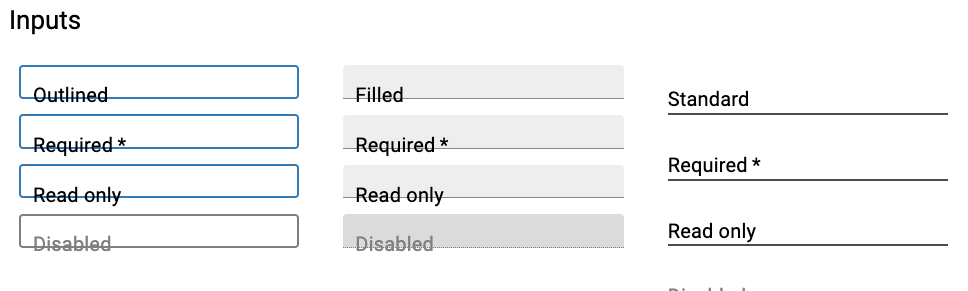
Bonus points if you can help me style the “Select” component…
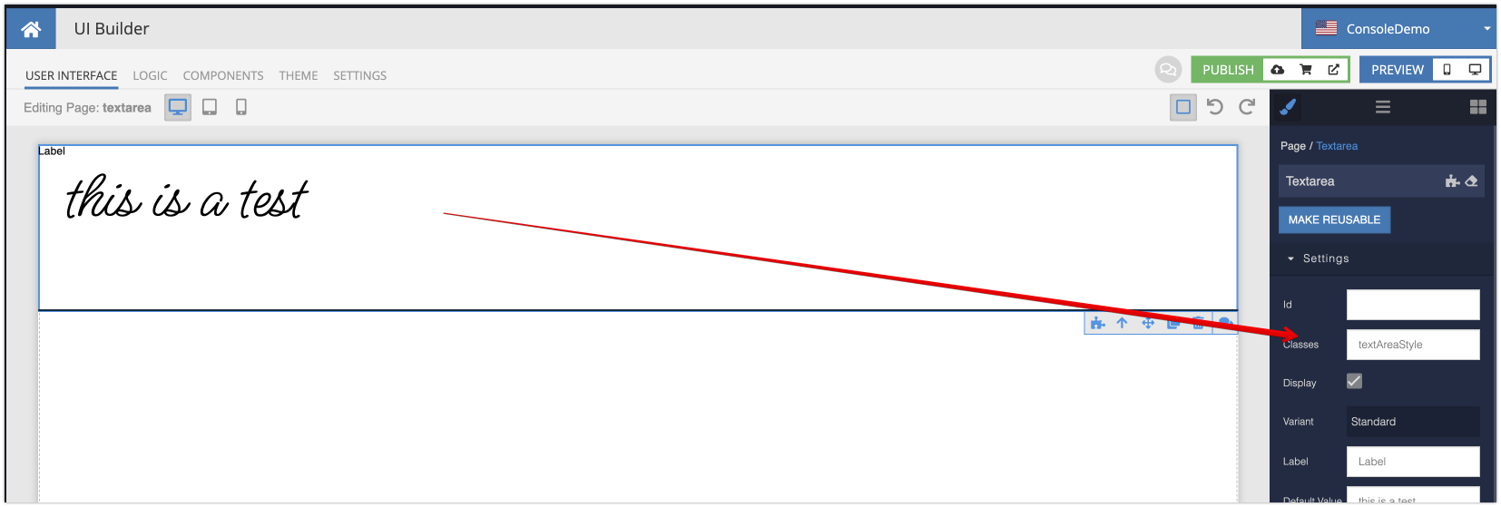
Select your component and assign a CSS class name. In my case, the class name is textAreaStyle (ignore the font styling for now, we will get to it later on in the instructions):
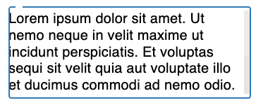
This is the result of setting the padding to zero in UI Builder, and what I would expect:
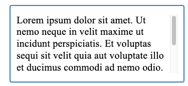
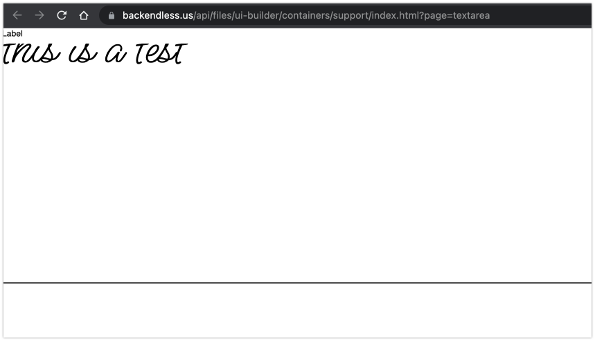
But here is what it looks like in the desktop preview window:
There is no other CSS in the extension, just:
.textAreaStyle textarea {
padding: 0px;
}
Setting the padding to a high value works, just not low.
Although I just checked in the preview theme window and it looks like this even without any css at all:
So there may be a some anomaly with things since the text on the left hand boxes is shifted with nothing applied. I flushed cache and reloaded backendless to no effect.
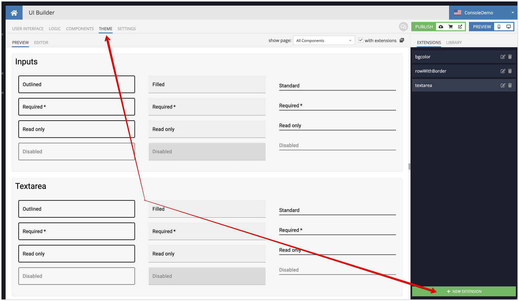
Unbeknownst to me there was text styling markup in the “library” tab in the theme section which was the cause of the weird display in the preview window. No change in textarea, but I think I figured out why. You can recreate it:
Make new blank app
drag in a textarea and set its dropdown to outline
place this css in an extension:
.textAreaStyle textarea {
padding: 0px;
outline-style: dotted;
outline-width: 4px;
}
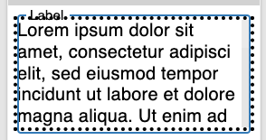
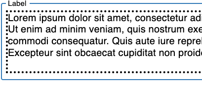
And you get this in UI Builder and Preview respectively:
It seems the Textarea component is not using the standard outline property for the “outlined” option, and whatever it’s wrapped in has its own padding(The same thing seems to be going on with the outlined version of “Select”) But it works in UI Builder interface for everything which is interesting. As a workaround, I’ll put the standard textarea into a block with a border to match the theme outline. Not sure what I’ll do about the select box though.