Hi backendless!
I’ve been struggling finding where in the backendless UI builder environment I can access and see the opinionated hover-effect the drop down arrow button currently have.
Also same thing for the input box.
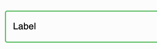
Before Selection:
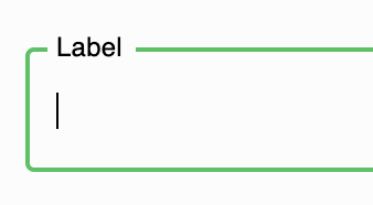
After Selection:
Please let me know!
Thank you for your help in advance,
Ian
Hello @Xingran_Ian
If I understand your question correctly, try the PREWIEV:
Regards,
Volodymyr
Hi Volodymyr,
I want to get rid of the hover effect for the button. But I do not know where the css for it is located. It is called “iconbtnExpandNav” and “iconbtnCollapseNav”.
I want to get rid of the select effect that comes with the input field as well.
Ian
Hello @Xingran_Ian,
You can set a custom animation for the input using these selectors:
Could you please clarify which component you mean (the styles for which button you would like to change)?
Regards,
Alexander
Hi Alenxander,
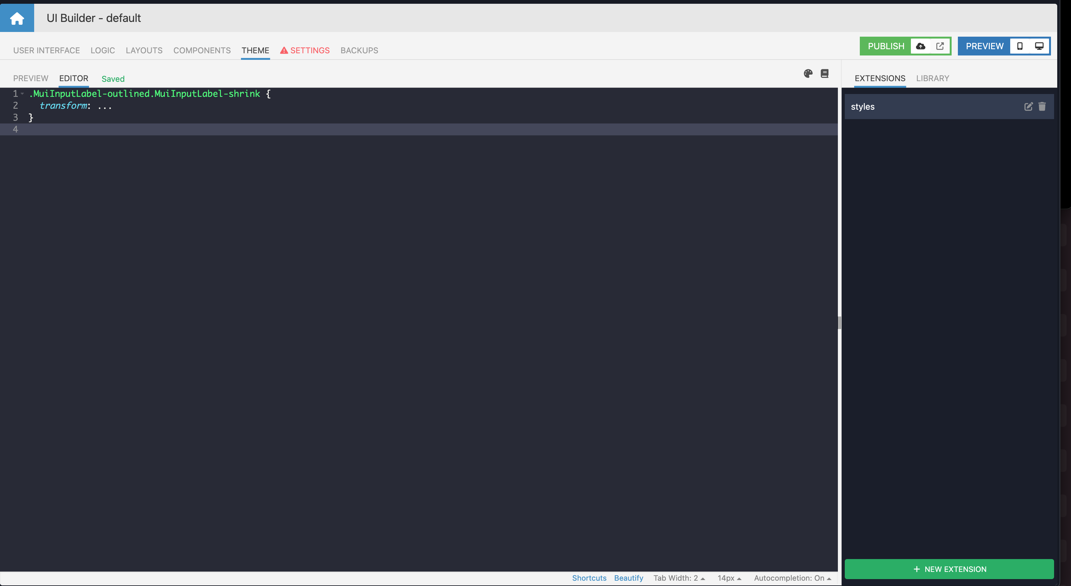
How can I use a text input that does not have ANY animation? Is there anywhere in the UI builder/access to the source-code where I can see the animation implementation for components and disable it? I see a lot of js event listeners on these components as well, how can I disable it completely?
Currently I understand it that when the cursor is in the input, the css class "MuiInputLabel-shrink " gets applied.
I saw in the js there’s a MouseIn MouseOut listener. Can I disable those and just use a plain text input?
Thank you.
Hi, @Xingran_Ian
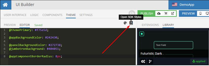
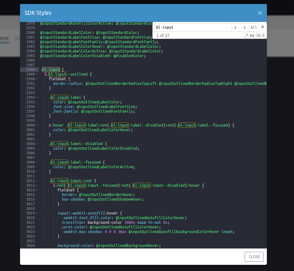
A listing of CSS classes and variables is available in the SDK Styles block. Click the Open SDK Styles icon in EDITOR section to see the implementation of component styles.
For removing animation from standard input you can use the following styles:
.bl-input {

  &.bl-input--standard {
    flex-direction: row;

    .bl-input-label{
      transition: none;
      position: relative;
      transform: none;
      align-self: flex-end;
      padding-bottom: 8px;
      margin-right: 10px;
    }

    .bl-input-input-root{
      flex:1;
      box-shadow: none;

      &:not(.bl-input-input--focused):not(.bl-input-input--disabled):hover::before {
        border-bottom: @inputStandardUnderline;
      }

      &::after {
        border-bottom: @inputStandardUnderline;
      }

      &::before {
        border-bottom: @inputStandardUnderline;
      }
    }
  }
}
MUI are complicated components and not always it decorates only with CSS.
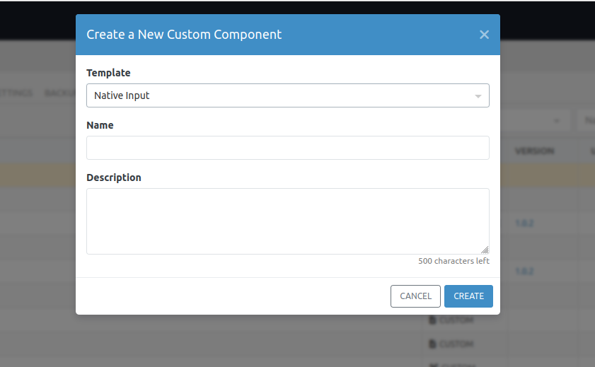
If you want to create your own plain text input without external styles and listeners, you can also do this by creating your own Custom Component.
Regards,
Serhiy
Thank you Serhiy, that’s exactly what I’m looking for.