Hi,
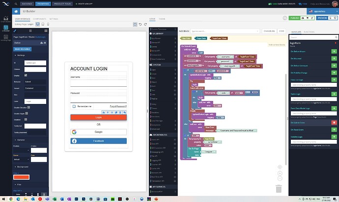
I’ve been working in the UI builder interface for a while now and I thought I would offer a suggestion to allow an expanded UI Builder environment for those developers that have the monitor space. Giving the option to work in an expanded UI Builder environment like the below image I think would increase development productivity a lot:
Some points:
-
At any time selecting the UI component on the left would load the corresponding logic on the right.
-
For a basic setup the event handler section on the right would only show the events available for the selected UI component, i.e. its always a left to right development process. A more advanced setup could be that the UI selection box on the left can change if a different component event handler is chosen on the right. Therefore working left to right or right to left is in sync.
-
It would be great that when selecting a UI component on the left the interface could remember the handler/logic section on the right that the developer was last coding for that specific UI component.
-
The codeless blocks (in the middle) could also be merged to the right with the event handler area or made visible using a combined search and codeless block hierarchy drop down box at the top of the logic screen to save more screen space.
I know there are probably many problems/exceptions with the above that would need to be managed but hopefully it could work. Once again thank you for a great product and support.
Regards
Glenn
