Hello,
do you know how can I hide/show blocks depending on responsiveness (screen size)?
Kind regards
Francesco
Maybe this helps:
https://support.backendless.com/t/device-responsive-pages-in-ui-builder/
Hello @Francesco_Ambrosoli
Welcome to the community!
You can get it by adding a new AppExtension and using CSS/Less you can describe which blocks should be visible or hidden.
Here is an example:
@media (max-width: @appLayoutMaxPhoneWidth) {
  .hide-mobile {
    display: none !important;
  }
}

@media (min-width: @appLayoutMinTabletWidth) and (max-width: @appLayoutMaxTabletWidth) {
  .hide-tablet {
    display: none !important;
  }
}

@media (min-width: @appLayoutMinDesktopWidth) {
  .hide-desktop {
    display: none !important;
  }
}
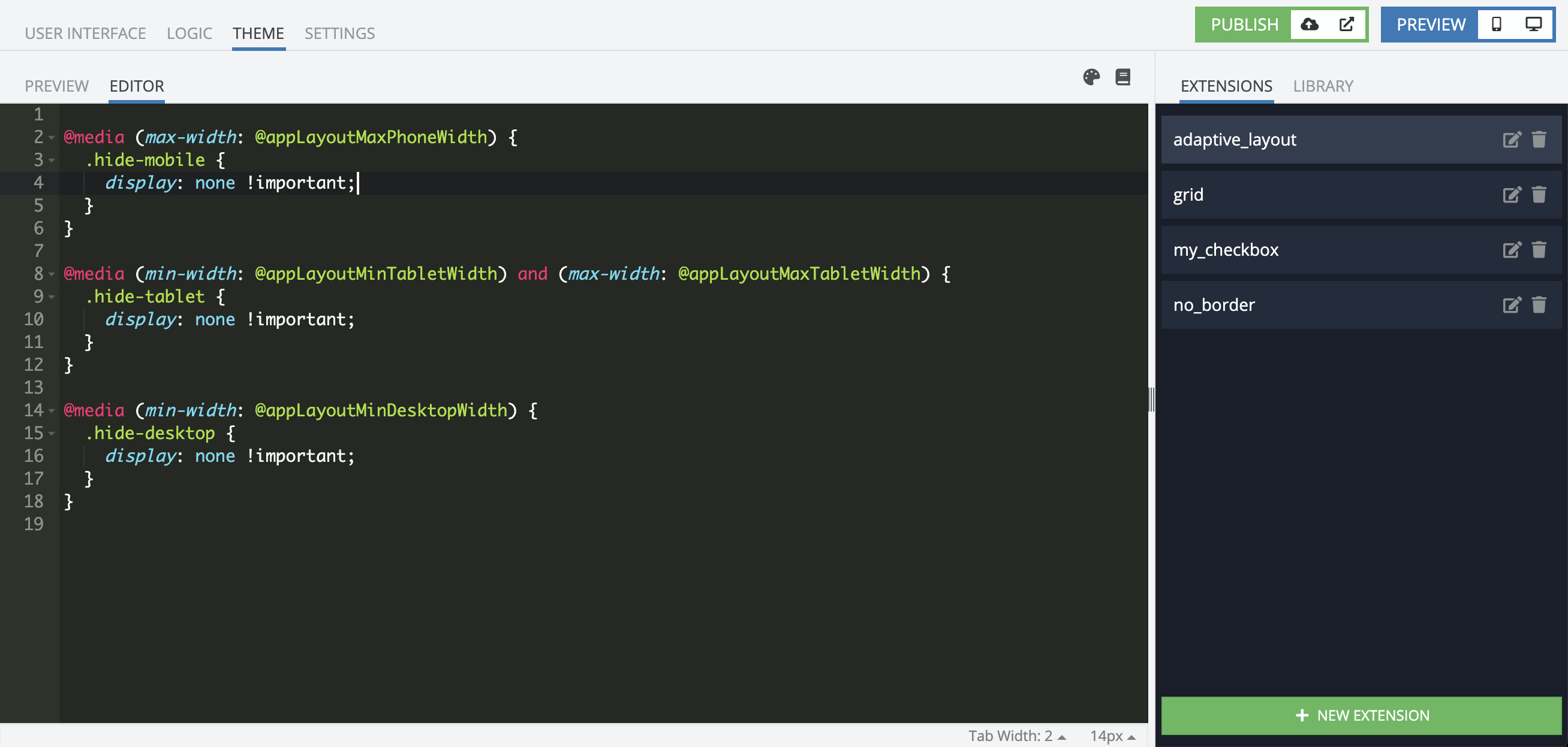
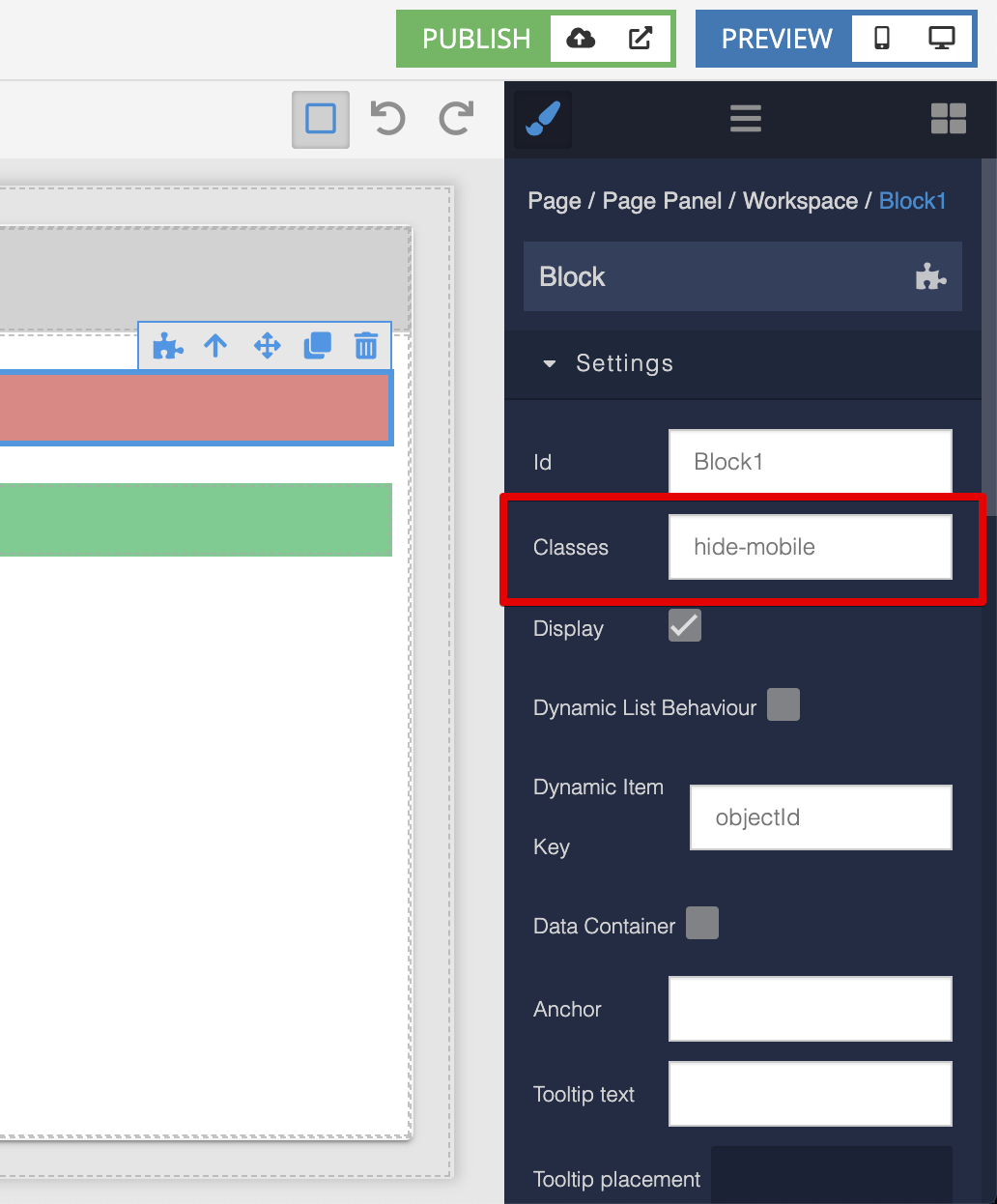
and then add these classes to blocks you need:
Regards, Vlad
1 Like
Hi Vlad,
Sorry for reviving an old thread but is it possible to have components only visible in web view but invisible in ipad/iphone view?
The code you provide only hides 1 with 2 still having the component visible. Reason why, and maybe you know a better solution to this, is because i don’t want my webapp full screen. So i added a container with 3 cells, middle cell has my content. On ipad/iphone this is obsolete since i want those to be full screen.
I hoped it was possible to map different dimensions to different screensizes but whatever you change in 1 view gets taken over by the other 2 aswell.
It would be nice to be able to set the styling options different for every screen.
Regards,
Thomas
Just add both classes to the component you want to hide: hide-mobile, hide-tablet 
1 Like
In addition, you can do something like this:
@media (max-width: @appLayoutMaxPhoneWidth) {
  .visible-tablet:not(.visible-mobile),
  .visible-desktop:not(.visible-mobile) {
    display: none !important;
  }
}

@media (min-width: @appLayoutMinTabletWidth) and (max-width: @appLayoutMaxTabletWidth) {
  .visible-mobile:not(.visible-tablet),
  .visible-desktop:not(.visible-tablet) {
    display: none !important;
  }
}

@media (min-width: @appLayoutMinDesktopWidth) {
  .visible-mobile:not(.visible-desktop),
  .visible-tablet:not(.visible-desktop) {
    display: none !important;
  }
}
take a look how it works https://backendlessappcontent.com/7E25B48A-05FA-0B5D-FFAE-63CC0AC26C00/A09B7B01-A9D5-43E6-AF33-6A774E4BB455/files/ui-builder/containers/default/index.html?page=adaptive
Regards, Vlad
1 Like