Hello @Francesco_Ambrosoli
Welcome to the community!
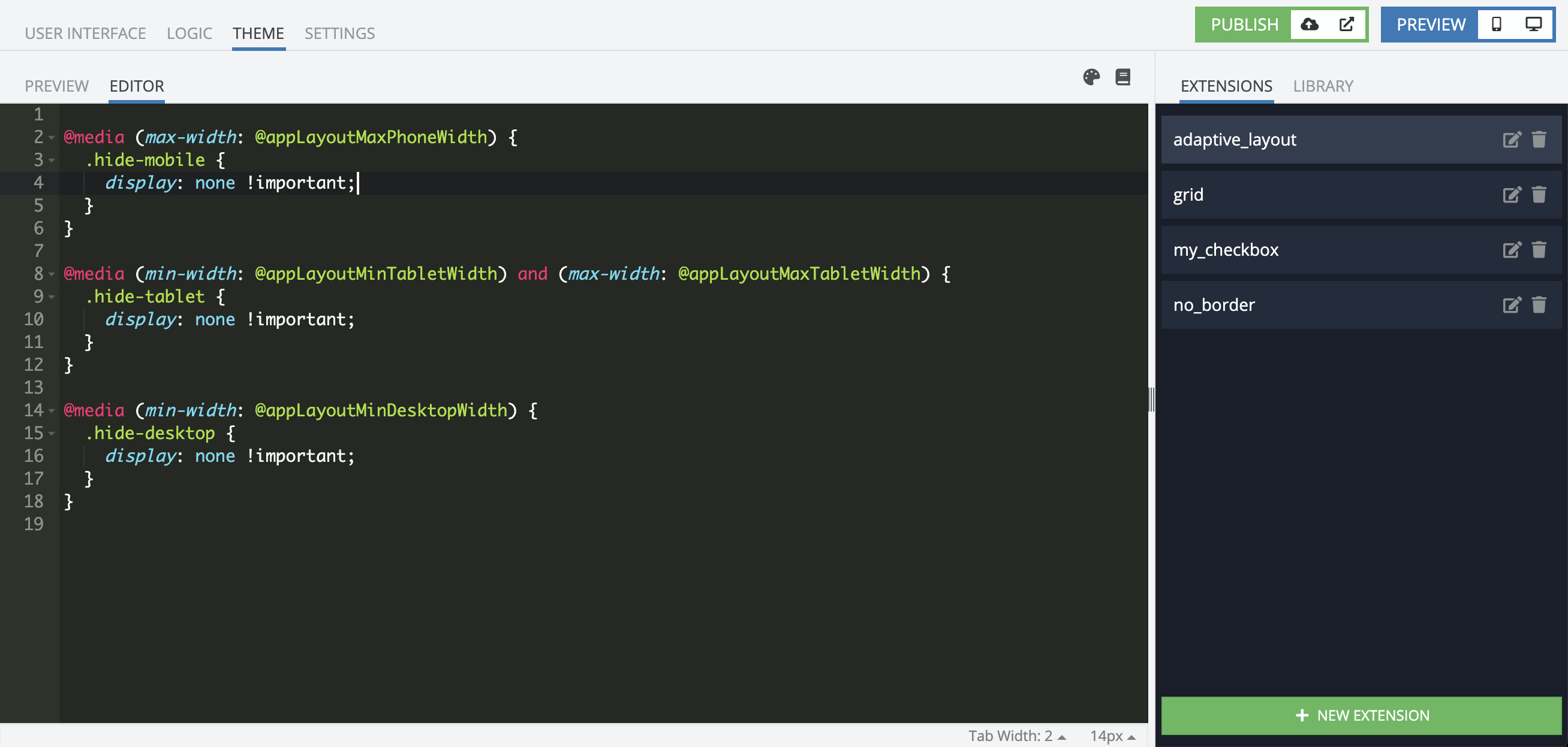
You can get it by adding a new AppExtension and using CSS/Less you can describe which blocks should be visible or hidden.
Here is an example:
@media (max-width: @appLayoutMaxPhoneWidth) {
  .hide-mobile {
    display: none !important;
  }
}

@media (min-width: @appLayoutMinTabletWidth) and (max-width: @appLayoutMaxTabletWidth) {
  .hide-tablet {
    display: none !important;
  }
}

@media (min-width: @appLayoutMinDesktopWidth) {
  .hide-desktop {
    display: none !important;
  }
}
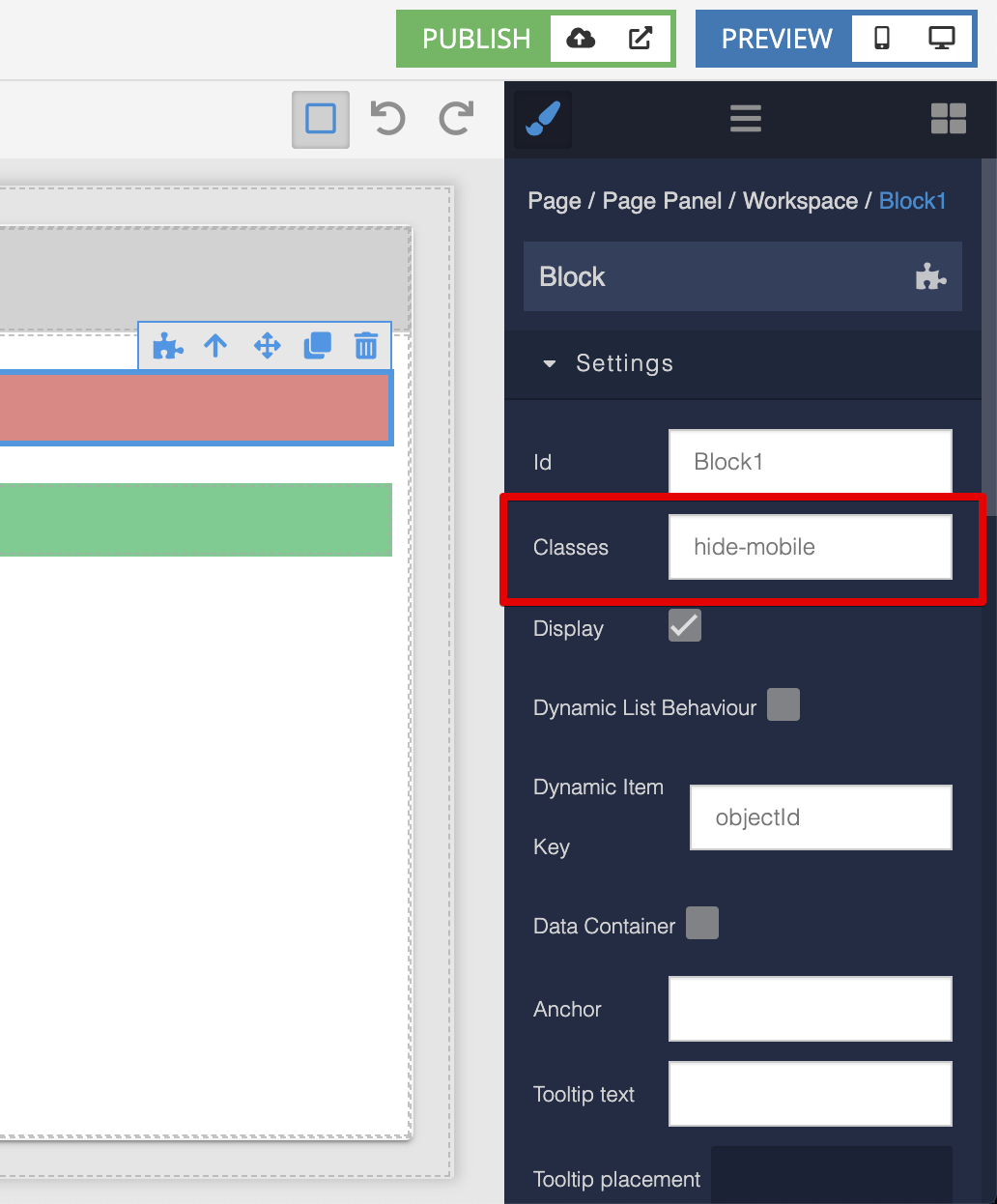
and then add these classes to blocks you need:
Regards, Vlad