Responsive

I do not understand the responsive ui builder.

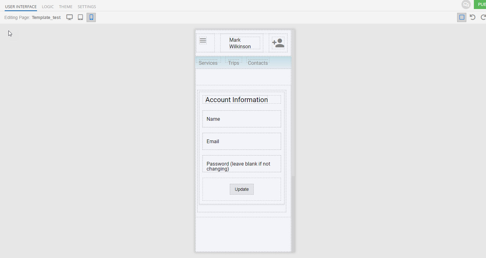
See video. It is fine in ui builder.
Application ID CE9CA061-AFDB-F16B-FF15-2A78893EF900
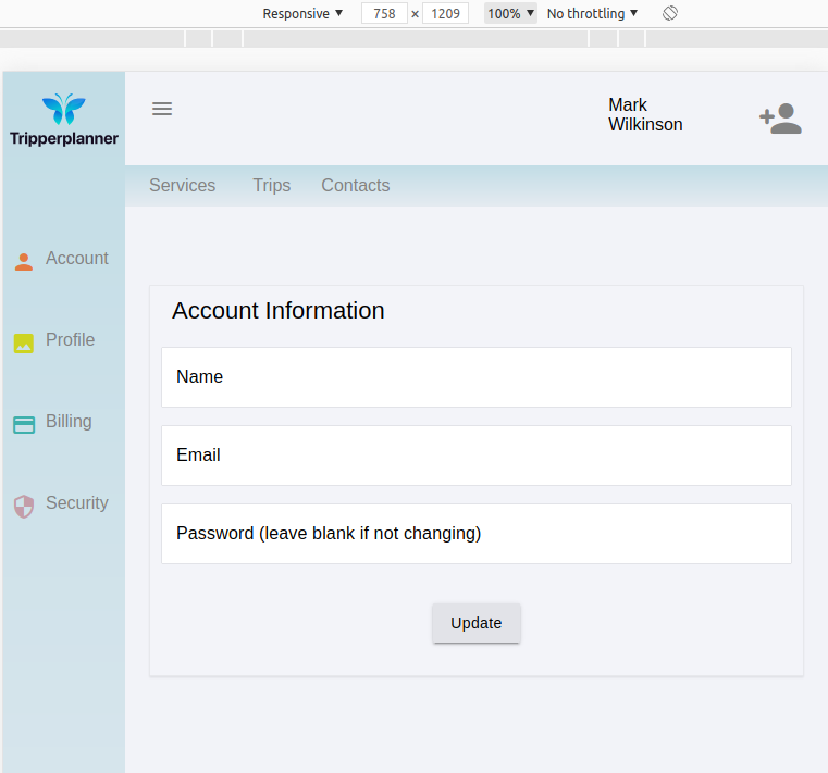
Tripperplanner > Template_Test

But

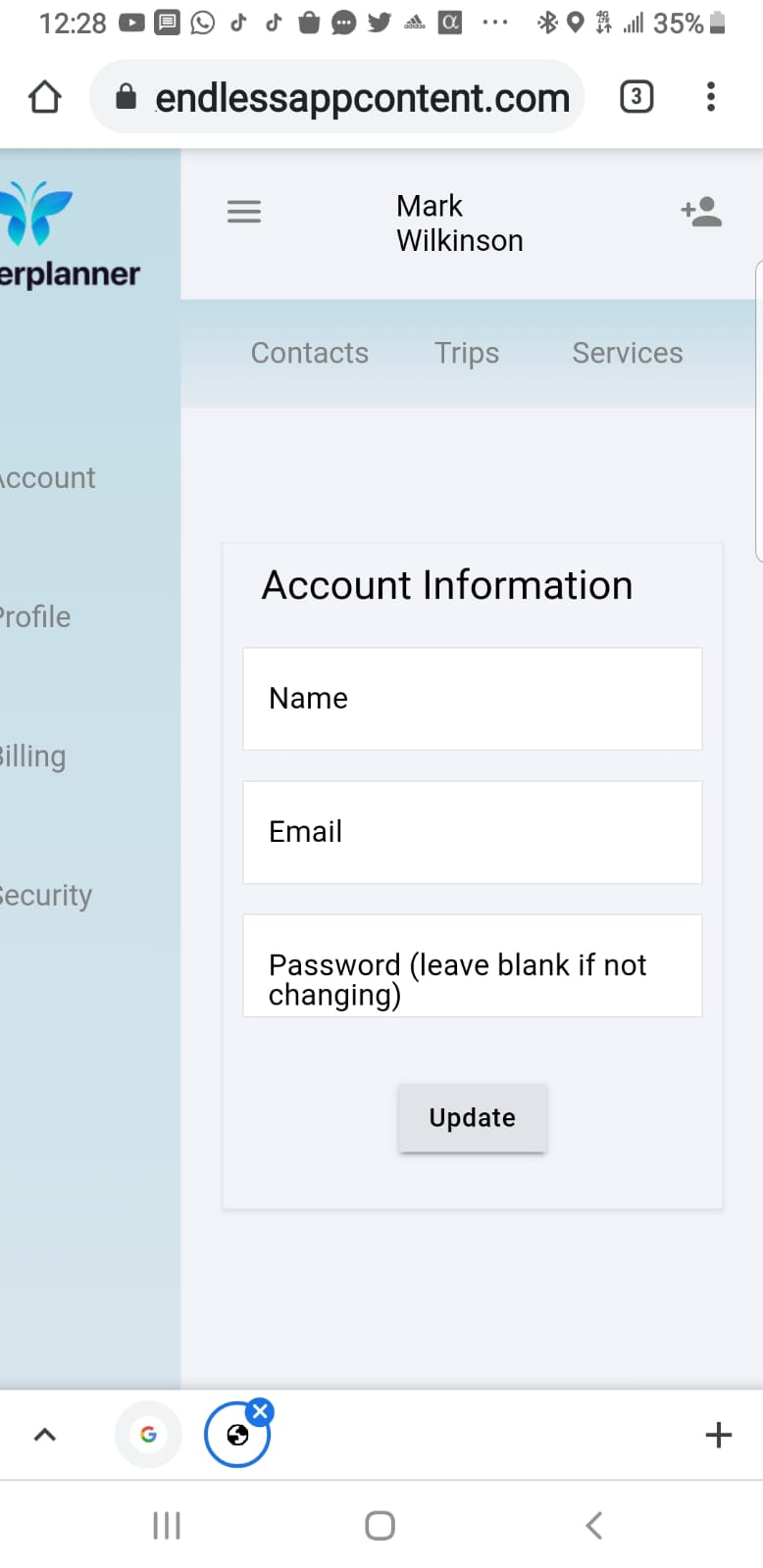
  1. when I view frontend and shrink it, it becomes none responsive?
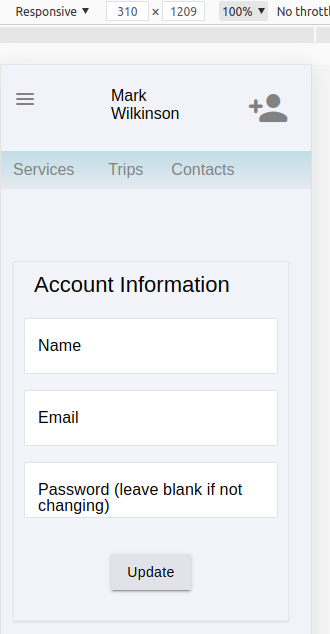
  2. On Mobile the menu bar disappears. Which actually is good. I just need to work out how to make it visible when hamburger menu is clicked on but, why does it disappear…
    05.27.2021-18.15.34

Hello @Mark_Wilkinson

Tablet and Mobile screen at UI builder has 758 / 310px width.
And you can see in the preview - all look like at UI builder (use dev tools because the browser can not be so shrink as a mobile screen at UI builder)


What about the sidebar - it’s there, but it’s gone over the edge of the window. If you want to do it visible, change the position for this element using the on click event. Here we have two way for it:

  1. Change style for the component.
  2. Add/remove class with position properties.

Regards, Dima

Hi Dima,

So you are saying that on desktop this would not be responsive with a side bar and could look like this in some browsers?

If so, its a real struggle to get a sidebar menu that would work with the ui builder. I suspect I am missing something?

Here’s an example of a responsive template we built for our marketplace:
https://eu.backendlessappcontent.com/D3DDBCE3-13A1-AE9B-FFF5-EA1554866F00/2F515357-F73C-4F5C-B0B7-B19295F8E69F/files/ui-builder/containers/default/index.html?page=home

is this the behavior you’re after?

Mark

Hi Mark,

I am trying to create a login template similar to https://call.novocall.co/
It functions like this https://www.screencast.com/t/pfxxR0kkiZki
Side bar for desktop
Tablet and Mobile hamburger that swipes out and in.

What I have at the moment is
Desktop that does not resize correctly. When it gets to hamburger view I need to swipe it in and out but am happy for the main area not to be responsive.

Mark

Hi Mark,

I believe this can be done, but it is outside of our support and is in the domain of the professional services (consulting) team. If you’d like to engage a consultant from our side, please contact sales@backendless.com.

Regards,
Mark

k. Thanks Mark.

Have a good weekend.

Still, the Mobile version when shown on a mobile phone.
https://backendlessappcontent.com/CE9CA061-AFDB-F16B-FF15-2A78893EF900/E72216FB-A303-4CAF-889D-E9FE93BE9E29/files/ui-builder/containers/default/index.html?page=Template_test
shows


which is different from the ui builder

Hello @Mark_Wilkinson

This is coming from different screen sizes.

In UI builder width - 310px
On your mobile i think its - 480 or higher.

Regards, Dima.

Either it does not confirm or, I am doing something fundamentally wrong. Why is it not being responsive on desktop. 05.31.2021-15.54.48

Hello @Mark_Wilkinson

I would recommend you to create a simple page with a Grid component, configure it as you need and then compare it with the problematic page.
There are lots of configurations/components and It’s quite tough to understand where exactly the issue is.

Regards, Vlad