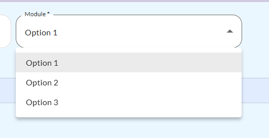
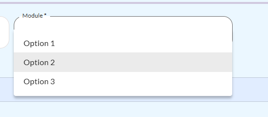
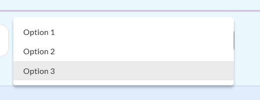
Hello, I have a select component in which when I display the 3 possible options that I have and click on them, the box that composes them rises over the select box.
What I want is for it to stay fixed below the select box regardless of whether I select one option or another.
How could I solve this in my code?
Mi codigo es el siguiente:
/-------------------------------------------------------------------------------------------------/
/---------------------------- Component: Select / Dropdown ---------------------------------/
/-------------------------------------------------------------------------------------------------/
.selectStandard {
/Colores principales/
–text-color: #2B2B2B; /* Color del texto en el input /
–text-font-size: 13px; / Tamaño de la fuente en el input /
–text-font-family: ‘Lato’, sans-serif; / Familia de fuente en el input /
–text-font-weight: 400; / Peso de la fuente en el input /
–background-color: #FFFFFF; / Color de fondo del campo de selección /
–background-color-focus: #FFFFFF; / Fondo cuando el campo está enfocado /
–background-color-disabled: #EFEFEF; / Color de fondo cuando el input está deshabilitado */
/* Estilos de la etiqueta (label) /
–label-color: #2B2B2B; / Color de la etiqueta en estado normal /
–label-color-disabled: #C2BDBD; / Color de la etiqueta cuando el input está deshabilitado /
–label-color-focus: #2B2B2B; / Color de la etiqueta cuando está enfocado (activo) /
–label-font-size: 13px; / Tamaño de la fuente de la etiqueta /
–label-font-family: ‘Lato’, sans-serif; / Familia de fuente de la etiqueta /
–label-font-weight: 400; / Peso de la fuente de la etiqueta */
/* Estilos del icono /
–dropdown-icon-color: #2B2B2B; / Color del icono de dropdown en estado normal /
–dropdown-icon-color-disabled: #C2BDBD; / Color del icono cuando está deshabilitado /
–dropdown-icon-color-focus: #6A6A6A; / Color del icono cuando está enfocado (activo) /
–dropdown-icon-color-hover: #304BF6; / Color del icono cuando se pasa el mouse por encima */
/* Bordes /
–border-color-focus: #6A6A6A; / Color del borde en estado activo /
–border-color-hover: #304BF6; / Color del borde en estado hover /
–border: 1px solid #2b2b2b33; / Borde predeterminado del campo /
–border-radius: 15px; / Radio del borde /
–options-shadow: 0px 4px 6px rgba(0, 0, 0, 0.1); / Sombra del menú de opciones */
/* Altura del campo de selección */
–selectOutlinedHeight: 15px; /Altura del campo de selección/
}
/* ----- NORMAL STATE ----- // Estilos de la etiqueta (label) en su estado normal /
.selectStandard .MuiFormLabel-root.MuiInputLabel-outlined {
font-family: var(–label-font-family) !important; / Fuente de la etiqueta /
font-size: var(–label-font-size) !important; / Tamaño de la fuente de la etiqueta /
font-weight: var(–label-font-weight); / Peso de la fuente de la etiqueta */
}
/* Estilo del color de la etiqueta, asegurándose que no se aplica cuando está deshabilitado /
.selectStandard .MuiFormLabel-root.MuiInputLabel-outlined:not(.Mui-disabled) {
color: var(–label-color) !important; / Color normal cuando no está deshabilitado */
}
/* ----- INPUT FIELD ----- // Estilos del campo de selección (select) en su estado normal /
.selectStandard .MuiInputBase-root.MuiOutlinedInput-root {
background-color: var(–background-color) !important; / Fondo del campo de entrada /
border-radius: var(–border-radius); / Bordes redondeados */
.MuiSelect-root {
    font-family: var(--text-font-family) !important; /* Fuente del texto */
    font-size: var(--text-font-size) !important; /* Tamaño de la fuente */
    color: var(--text-color); /* Color del texto */
    height: var(--selectOutlinedHeight); /* Altura del campo */
    border-radius: var(--border-radius); /* Bordes redondeados */
}

.MuiSvgIcon-root {
    color: var(--dropdown-icon-color); /* Color del icono por defecto */
}

fieldset.MuiOutlinedInput-notchedOutline {
    border: var(--border) !important; /* Borde del campo */
    border-radius: var(--border-radius); /* Bordes redondeados */
}
}
/* ----- FOCUS STATE ----- // Estilos cuando el campo de selección está enfocado (active/focused) /
.selectStandard .MuiInputBase-root.MuiOutlinedInput-root.Mui-focused {
.MuiSelect-root {
color: var(–text-color) !important; / Color del texto cuando está enfocado /
background-color: var(–background-color-focus) !important; / Fondo cuando está enfocado */
}
.MuiSvgIcon-root {
    color: var(--dropdown-icon-color-focus); /* Color del icono cuando está enfocado */
}

fieldset.MuiOutlinedInput-notchedOutline {
    border-color: var(--border-color-focus) !important; /* Color del borde cuando está enfocado */
}
}
/* ----- HOVER STATE ----- // Estilos cuando el cursor pasa sobre el campo de selección */
.selectStandard .MuiInputBase-root.MuiOutlinedInput-root:hover {
&:not(.Mui-disabled) {
    /* Asegura que no se apliquen los efectos hover cuando está deshabilitado */
    .MuiSvgIcon-root {
        color: var(--dropdown-icon-color-hover); /* Color del icono al pasar el mouse */
    }

    fieldset.MuiOutlinedInput-notchedOutline {
        border-color: var(--border-color-hover) !important; /* Color del borde al pasar el mouse */
    }
}
}
/* ----- DISABLED STATE ----- // Estilos cuando el campo de selección está deshabilitado /
.selectStandard .MuiInputBase-root.MuiOutlinedInput-root.Mui-disabled {
background-color: var(–background-color-disabled) !important; / Fondo cuando está deshabilitado */
.MuiFormLabel-root.MuiInputLabel-outlined {
    color: var(--label-color-disabled) !important; /* Color de la etiqueta cuando está deshabilitado */
}

.MuiSelect-root {
    color: var(--text-color) !important; /* Color del texto cuando está deshabilitado */
}

.MuiSvgIcon-root {
    color: var(--dropdown-icon-color-disabled); /* Color del icono cuando está deshabilitado */
}
}
/* ----- DROPDOWN BOX CONTAINER AND OPTIONS ----- // Estilos para el contenedor del menú desplegable /
.selectStandard__menu-paper {
margin-top: 50px !important; / Espaciado opcional entre el select y el dropdown /
border: none !important; / Sin borde en el contenedor /
box-shadow: 0px 4px 4px rgba(0, 0, 0, 0.25); / Sombra en el menú desplegable */
.MuiMenuItem-root {
    font-family: var(--selectOutlinedLabelFontFamily) !important; /* Fuente del texto */
    font-size: var(--selectOutlinedLabelFontSize) !important; /* Tamaño de la fuente */
    font-weight: var(--selectOutlinedLabelFontWeight) !important; /* Peso de la fuente */
    color: var(--selectOutlinedLabelColor) !important; /* Color del texto */
}
}