The Input component seem higher than necessary. In trying Theme Extensions I get this:
Inputs
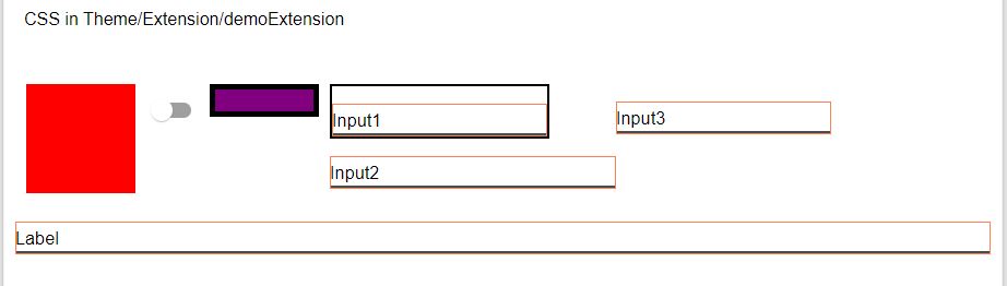
Input1 (class bdr – ‘border: 2px solid black;’) shows default height.
Input2 (class hth) sets the height (height: 30px;) and a border (border: 2px solid black;
border-color: coral;)
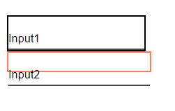
The preview shows the coral border around a 30px area in Input2, but the text and underline are outside, making its effective height the same as Input1.
Is there a way to reduce Input component height?
Try the following CSS class definition in your extension:
.MuiInputBase-root {
  height:40px;
}
Doesn’t change the space (height) used up; does change the area a border goes around.
What scary is:
Think this one may be beyond my CSS ‘grade level.’
That’s not scary, that’s how CSS works. That class is the base class for all input components in UI Builder.
‘Scary’ in the sense that what seemed like a simple change caused unexpected results, at least to this CSS newbie.
I figured ‘MuiInputBase-root’ was the root of something, as CSS is a cascading system. Will be a while before I’m ready to tackle this kind of problem.