Setting font-size for DateTimePicker

I was struggeling how to simply change the font size and font color for my date time picker component (the selected field value, not the picker itself). How to do this with themes?
Would be good to have a component configuration option “Typography” for this.

Regards,

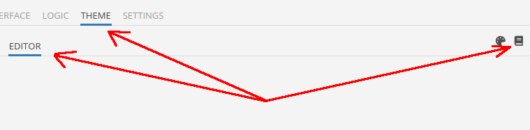
You could open SDK Styles for all UI Components, and change something with variables that we provide, or add a new property in the styles tree with custom styles.

Here a little guide for this - link

Regards, Dima.

@Dima ,
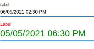
I know the basic way to modify a theme. However, I cannot figure out how to change the font-size of the date time picker. There is no variable encoding this. The date time picker SDK class is not really an easy one:

.bl-datetime-picker {

  //label
  .MuiFormLabel-root {
    color: @datetimePickerLabelColor;

    &.Mui-focused {
      color: @datetimePickerLabelColorActive;
    }

    &.Mui-disabled {
      color: @datetimePickerLabelColorDisabled;
    }
  }

  .MuiInputBase-root {
    &.MuiOutlinedInput-root {
      border-radius: @datetimePickerOutlinedBorderRadius;

      .MuiInputBase-input {
        color: @datetimePickerOutlinedInputColor;

        &:hover {
          color: @datetimePickerOutlinedInputColorHover;
        }
      }

      &:not(.Mui-disabled) {
        .MuiOutlinedInput-notchedOutline {
          border: @datetimePickerOutlinedBorder;
          box-shadow: @datetimePickerOutlinedShadow;
        }

        &.Mui-focused {
          .MuiOutlinedInput-notchedOutline {
            border: @datetimePickerOutlinedBorderActive;
            box-shadow: @datetimePickerOutlinedShadowActive;
          }
        }

        &:hover {
          .MuiOutlinedInput-notchedOutline {
            border: @datetimePickerOutlinedBorderHover;
            box-shadow: @datetimePickerOutlinedShadowHover;
          }
        }
      }

      &.Mui-disabled {
        .MuiOutlinedInput-notchedOutline {
          border: @datetimePickerOutlinedBorderDisabled;
          box-shadow: @datetimePickerOutlinedShadowDisabled;
        }
      }
    }

    &.MuiInput-underline {
      .MuiInputBase-input {
        color: @datetimePickerUnderlineInputColor;

        &:hover {
          color: @datetimePickerUnderlineInputColorHover;
        }
      }

      &:before {
        border-bottom-color: @datetimePickerUnderlineBorderColor;
        border-bottom-width: @datetimePickerUnderlineBorderSize;
        border-bottom-style: @datetimePickerUnderlineBorderType;
        box-shadow: @datetimePickerUnderlineShadow;
      }

      &:after {
        border-bottom-color: @datetimePickerUnderlineBorderColorActive;
        border-bottom-width: @datetimePickerUnderlineBorderSizeActive;
        border-bottom-style: @datetimePickerUnderlineBorderTypeActive;
        box-shadow: @datetimePickerUnderlineShadowActive;
      }

      &:hover:not(.Mui-disabled):not(.Mui-focused):before {
        border-bottom-color: @datetimePickerUnderlineBorderColorHover;
        border-bottom-width: @datetimePickerUnderlineBorderSizeHover;
        border-bottom-style: @datetimePickerUnderlineBorderTypeHover;
        box-shadow: @datetimePickerUnderlineShadowHover;
      }

      &.Mui-disabled:before {
        border-bottom-color: @datetimePickerUnderlineBorderColorDisabled;
        border-bottom-width: @datetimePickerUnderlineBorderSizeDisabled;
        border-bottom-style: @datetimePickerUnderlineBorderTypeDisabled;
        box-shadow: @datetimePickerUnderlineShadowDisabled;
      }
    }
  }
}

I tried varous ways to include a font-size here, but wasn’t successful. Please advice.

Generally, It should be easy to change such basic things as font-sizes and font-colors. So please add a “Typography” section for the date time picker to your backlog.

Thanks and best regards,

image

.bl-datetime-picker {
  .MuiFormLabel-root {
    color: red;
    font-size: 20px;
  }

  .MuiInputBase-root {
    &.MuiInput-underline {
      .MuiInputBase-input {
        color: green;
        font-size: 30px;
      }
    }
  }
}

Could you try this?

Regards, Dima.

It works indeed!
Thanks