In the simple modal UI component, there are two buttons (submit & close). We can style these buttons OK… but we would like to style one button different from the other. Is there any work-around way to do this? Perhaps using Codeless blocks in in the button logic (which we have access to)?
If not, any chance you could add some extra options to the component so we can target the style for each button independently? Thnx
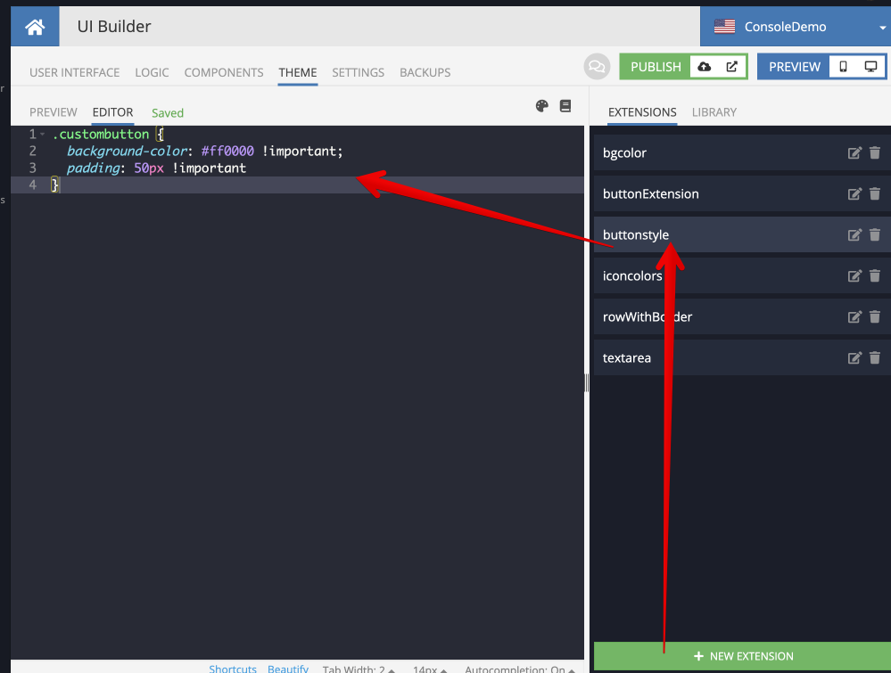
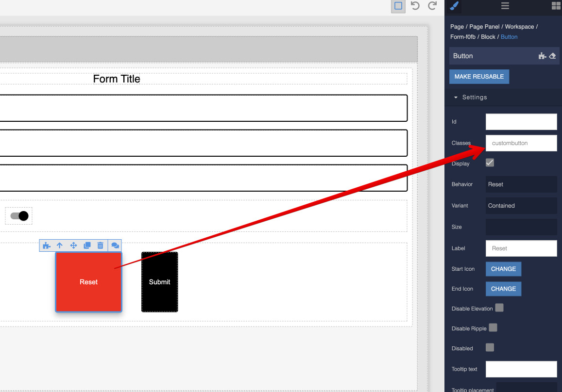
This can be done by creating a CSS class and assigning it to a component. For example:
Define a CSS class:
Assign the class to a component:
Hope this helps.
Mark
Hi Mark, yes we know how to assign classes to components 
But the marketplace “simple modal” (Simple Modal Component | Backendless Marketplace) is a custom component, created by Backendless. It contains buttons which cannot be isolated and given id’s or classes, as far as I know. Sorry, I should have been more explicit that I mean the marketplace UI component 
Hi @Alex_Klein,
Currently, there is no way to change the styles for each button separately. I created an internal ticket MARKET-1858. After that, unique classes will be added to the buttons, and you will be able to customize the styles for each button separately.
We will notify you when it is done.
Regards
Nazar
1 Like
Hi Nazar, another question about the “simple modal” component: we can add logic for when “close” button is clicked. However, when user clicks outside of the modal, the modal closes but of course the “close” button is not clicked in that case. Is there a way to trigger logic when the modal is closed by user clicking outside?
I tried to trigger things “on visibility change” but it seems the visibility of the modal doesn’t actually change when it is opened or closed.
Perhaps a general “when modal closes” logic area? Thanks for all you do 
@Alex_Klein ,
Unfortunately it is not possible with the current implementation of the component. I have created an internal ticket MARKET-1861 to add such feature. We will notify you in this thread when feature will be available.
Regards, Andriy
1 Like
Hi @Alex_Klein ,
Right now “On Close Button” event is triggered when clicking on “Close Button” and when clicking outside of the component. And in this event, you can write the closing logic of a simple modal and some additional logic of your own.
Regards, Pavlo
Hi @Alex_Klein,
We have released an updated “Simple Modal” component.
Now you can add styles for each button separately.
Also, now the logic of closing the modal window will work when user clicking outside the window itself. Please, could you confirm that it works for you?
Regards
Nazar
1 Like
Hi Nazar, thanks for the work on the “simple modal” component… it works great/better… but I’m afraid it’s still not something we can use. Why? We have some dialogs where two buttons give the user a choice “A” & “B”, each with some logic. We can re-purpose the “Close” button to be choice “A”… but the problem is then that clicking outside of the modal executes logic for “A”, when really clicking outside should always just close the modal, without executing any logic.
Backendless recently introduced the “pop container” feature where we can put ANY kind of components and content inside of a reusable component. This is very powerful and just what we need, in many different places. I was using this to make a reusable modal (based on the Backendless modal recipe, which generally works great except:
A) It’s hard to work with, the content inside is hidden and we have to change classes or rearrange things in the tree to be able to work with content… and more importantly
B) this modal for some reason is not always in the forefront (z index related perhaps)
But the “simple modal” marketplace component is always robustly in the forefront. It is also very smooth because there’s a fadeout for closing it. I would really love to reproduce the essence of this component myself. Perhaps you can point me to a place or article where the construction of the modal is described? There seem to be many ways to build a modal… please share the general approach you used for the “simple modal” component
Hi there @Alex_Klein,
If I’m not mistaken, some time ago we discussed that logic should work when an area outside the button was clicked:
Hi Nazar, another question about the “simple modal” component: we can add logic for when “close” button is clicked. However, when user clicks outside of the modal, the modal closes but of course the “close” button is not clicked in that case. Is there a way to trigger logic when the modal is closed by user clicking outside?
Have your goals changed?  Or I missed something…
Opening the Simple Modal component in the marketplace gives links to the documentation. Please check them out:
https://github.com/Backendless/ui-builder-library/blob/main/components/bl-simpleModal-component/README.md
Regards,
Marina
Hi @Alex_Klein,
I would like to add that at the link shared by Marina, you can find the source code of the component itself and use it to create your own custom modal window, modifying the logic in the way that suits you best. We also warmly welcome the initiative to create and publish custom components from our users (especially our regular and enthusiastic users like you), and will also gladly take into account any ideas/suggestions to improve the existing component, if you have any. 
Regards,
Stanislaw
1 Like