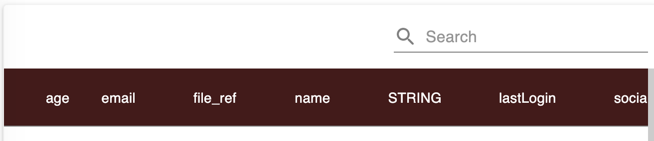
Hi. I’m trying to style the Data Table component via a custom Theme extension that overrides CSS styles and so far I’m not successful. I would love some help. I’m trying to color the header cells and alternate rows as follows:
Which elements would you define in an extension to override the Theme? Thanks!
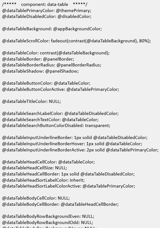
Snippet of the Theme for Data Table component:
Hello @Marc_Chriqui
try the following styles:
.bl-data-table {
    .bl-data-table-head-cell {
       background-color: #481818 !important;

       .MuiButtonBase-root:not(.Mui-disabled){
         color: #fff;
       }
    }
}
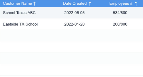
Thanks! It works, and I also successfully changed the styles for alternate rows, however I seem to have lost the hover effect on rows. Do you know why? I didn’t override the hover style.
My code:
.bl-data-table
{
.bl-data-table-head-cell
{
background-color: #4f94e8 !important;
.MuiButtonBase-root:not(.Mui-disabled)
{
  color: #fff;
}
}
.bl-data-table-row
{
&:nth-child(2n)
{
background-color: #ffffff;
}
&:nth-child(2n-1)
{
  background-color: #f5f5f5;
}
}
}
I believe it’s because of CSS Weight Rules
!important has the highest priority
Ok but I only added !important to: background-color: #4f94e8 !important;
The hover style shouldn’t have been affected.
Not a big deal, thanks for your help.
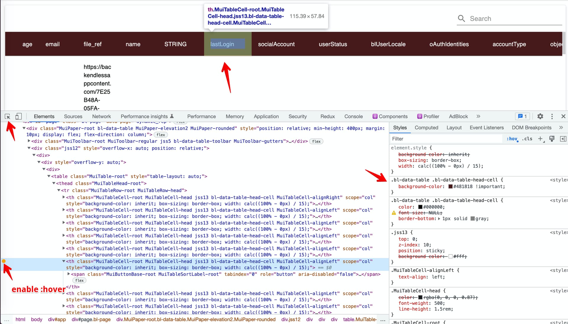
the best way is to select a particular element and then check its styles
1 Like