I am trying to find a good way to use the UI Builder while doing changes to MUI components, and I am uncertain as to what is the best way to go forth. Looking at the MUI documentation site, it refers to ways of doing things with js that I don’t think is they way forward.
I also see they are using lots of properties that are not exposed in the UI Builder interface for many elements.
What I fall back to is to do overrides using CSS, but I am not sure if that is the best way of working, and would really love to see some examples of doing this more “proper”.
Some examples of things that I am struggling to find good solutions to:
- Having all input fields of a certain type, e.g. standard, not having animated labels, but constanly visible on the left side of the input field instead
- using the built-in error and helperText properties for field/input validation
Hi @Egil_Helland
The UI Builder is based on different components including MUI and custom HTML components.
The designer has a common interface customizing components/blocks, therefore there are not all properties from MUI and/or there are other properties.
Adding ThemeExtensions (Styles) is the way to go to override the basic appearance
https://backendless.com/docs/uibuilder/ui_extensions.html
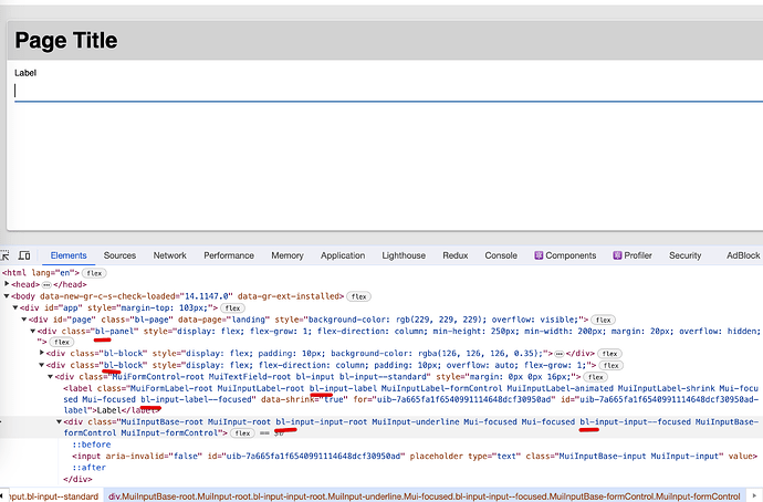
Normally, each sub-component (DOM element) has its own CSS class which starts with bl- we use them to apply the default theme and you can use them to apply your own styles
Regards,
Vlad
Thanks for explaining, Vlad. Then I’ll continue to do what I was already doing, using CSS and style extensions 
Only problem is that doing different styling of input form elements outside of the three main styles is very tricky, as long as the MUI elements are animating and resetting those at least for me is not an easy task… 
MUI are complicated components and not always it decorates only with CSS, however, we can cover most of the cases.
For having a label in front of the input and for removing animation you can use the following styles
.bl-input {

  &.bl-input--standard {
    flex-direction: row;

    .bl-input-label{
      transition: none;
      position: relative;
      transform: none;
      align-self: flex-end;
      padding-bottom: 8px;
      margin-right: 10px;

      &,
      &.bl-input-label--focused{
          color: #888;
      }

    }

    .bl-input-input-root{
      flex:1;
    }
  }
}
btw, you can use LESS https://lesscss.org/
here is my demo page https://skilledhome.backendless.app/api/files/ui-builder/containers/default/index.html?page=landing
Thanks a million, Vlad - I still have so much to learn!
What version of Less is supported btw? I know it somewhat, but I see from the docs there are some dialect changes in version 3.5.
Thanks again! 
we use the latest 4.x version of the Less module
1 Like
