Hi,
Please find attached a suggestion for making the Data Management page more user friendly.
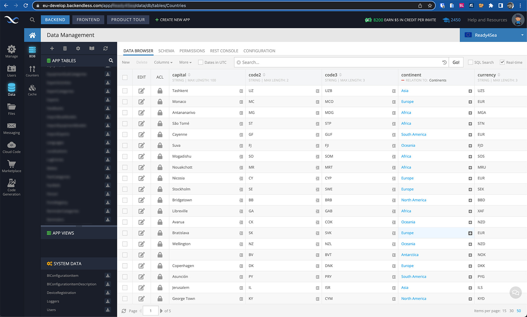
I have many tables, and always find myself having to look hard to see which table I’m actually looking at. When the table is hidden in the left scrolling list, either I have to scroll up or down to find it. Or I end up having to look at the URL. It’s quite a pain (see first screenshot).
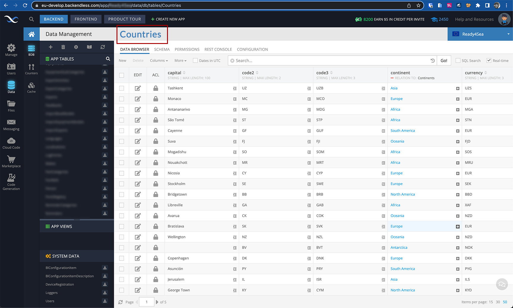
My second screenshot is a suggestion : simply add a large blue title that makes it plainly visible what table that is.
If you like this idea, please upvote it.
Thanks for the great platform and the great work.
Nicolas