I have two textareas placed within a horizontally aligned block
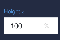
I want to achieve that both textareas show the same vertical extent although they contain different amounts of text rows. I’ve tried to set their height to 100% but this shows no effect.
Is there a way to achieve this?
Regards,
Hi @Klaas_Klever
We don’t have this feature in the box. Adding such a feature is not an easy task.
Maybe there is a solution on StackOverflow or in the Material-UI community that you could apply.
Regards,
Viktor
Hi @Viktor_Mudrevsky ,
I’ve found a workaround. I’m using the textarea variant “Standard” and I’m drawing a border around the boxes containing the textareas. The box borders align well then.
Still one thing which is an issue for me: I cannot get rid of the bold underline for the textarea with variant “Standard”.

By which CSS magic can I get rid of this underline?
Regards,
I’ve figure it out 
.textAreaNoUnderline {
  &.bl-textarea--standard {
    .bl-textarea-input-root {
      &::before {
        border-bottom: none;
      }
      &:not(.bl-textarea-input--focused):not(.bl-textarea-input--disabled):hover {
        &::before {
          border-bottom: none;
        }
      }
    }
  }
}
1 Like
Hi Klaas,
How did you manage to set the height for the textarea?
Regards,
Jean-Michel
Hello @Klaas_Klever , @Michel_Loriaux
For each textarea:

with:
.bl-textarea-input-root {
  height: 100%;
}
must be enough


