Hi I’m looking for the API calls and I found the reports are processing a lot of API calls to produce the graphics, for that reason I would like to start looking the new Visualizations.
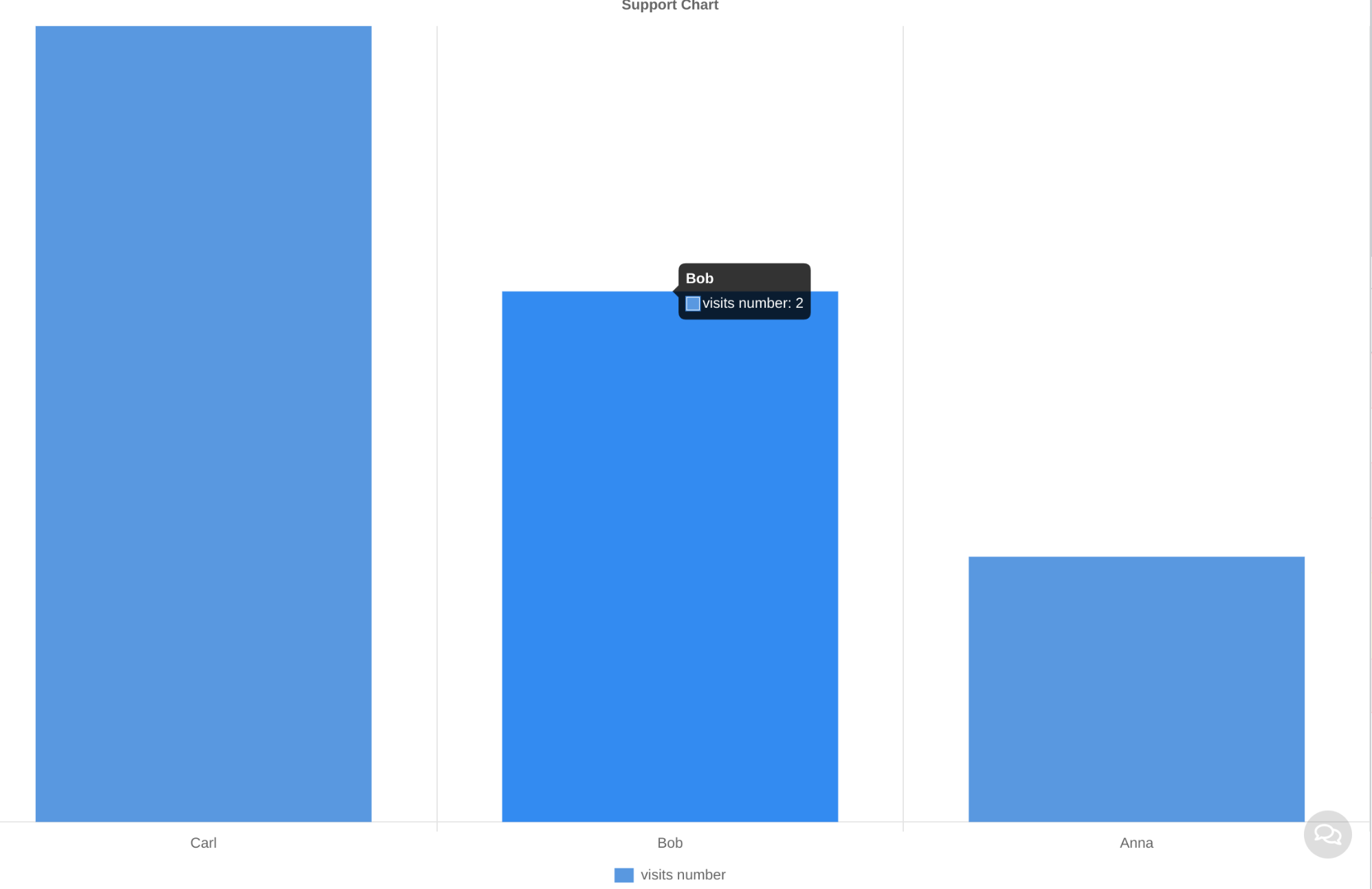
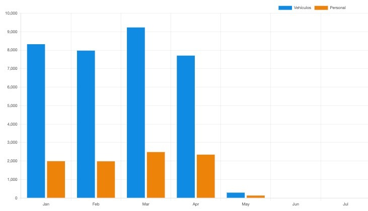
My first chart should be the number of visit per day in a specific Client.
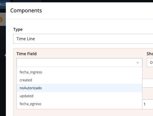
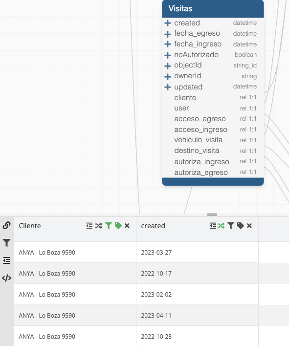
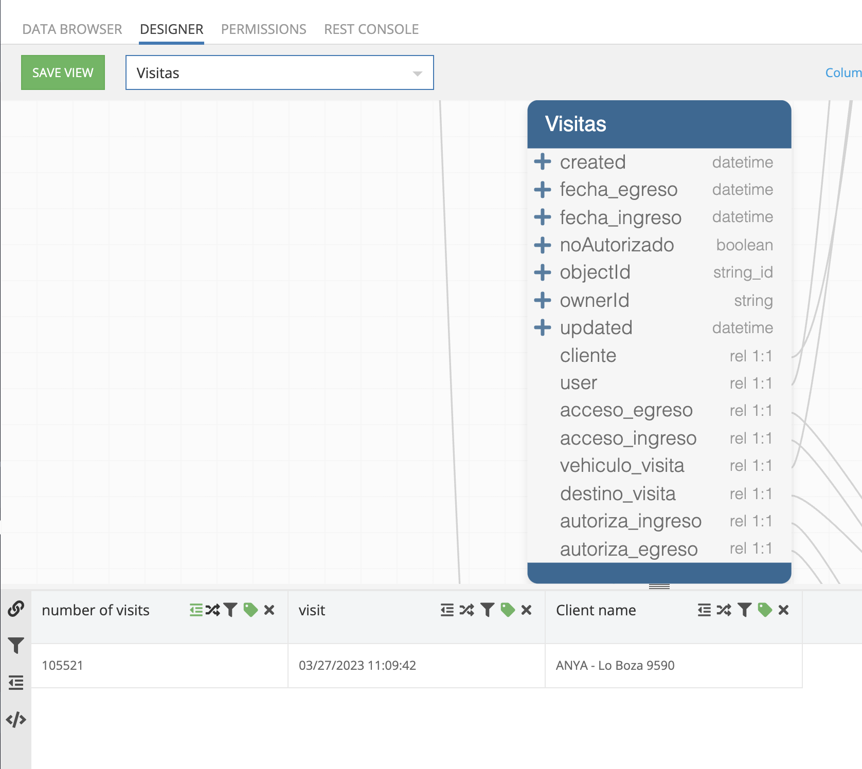
How to count records by day? This are the only fields at the Visit table.
My idea was go with Apps View but I need a count column
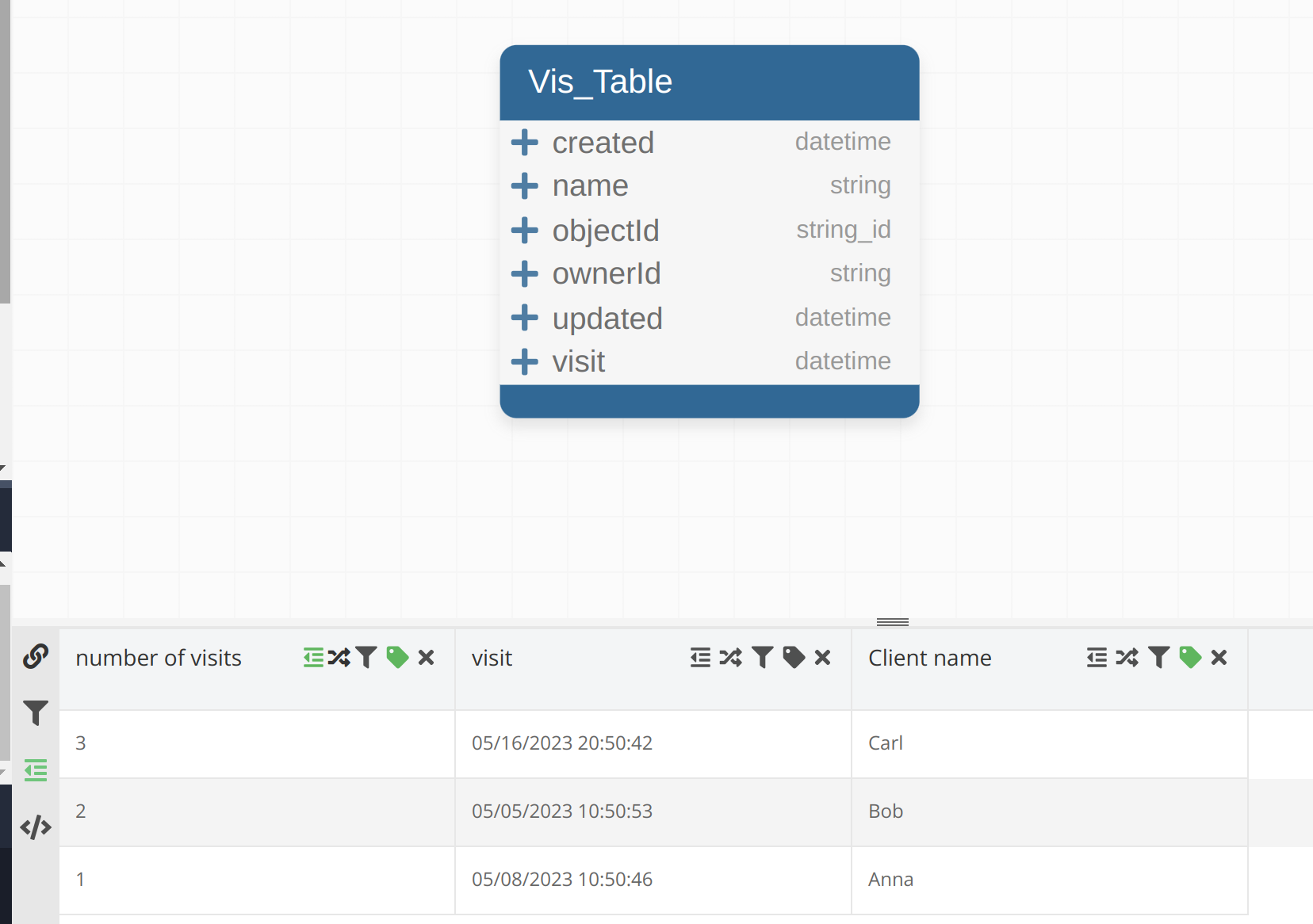
“number of visit” was made by aggregation of “objectId”, visit it’s created the information to know how many “visits” are per day and finally “Client name” the “cliente” 1:1 to select witch of the clients information will be draw.
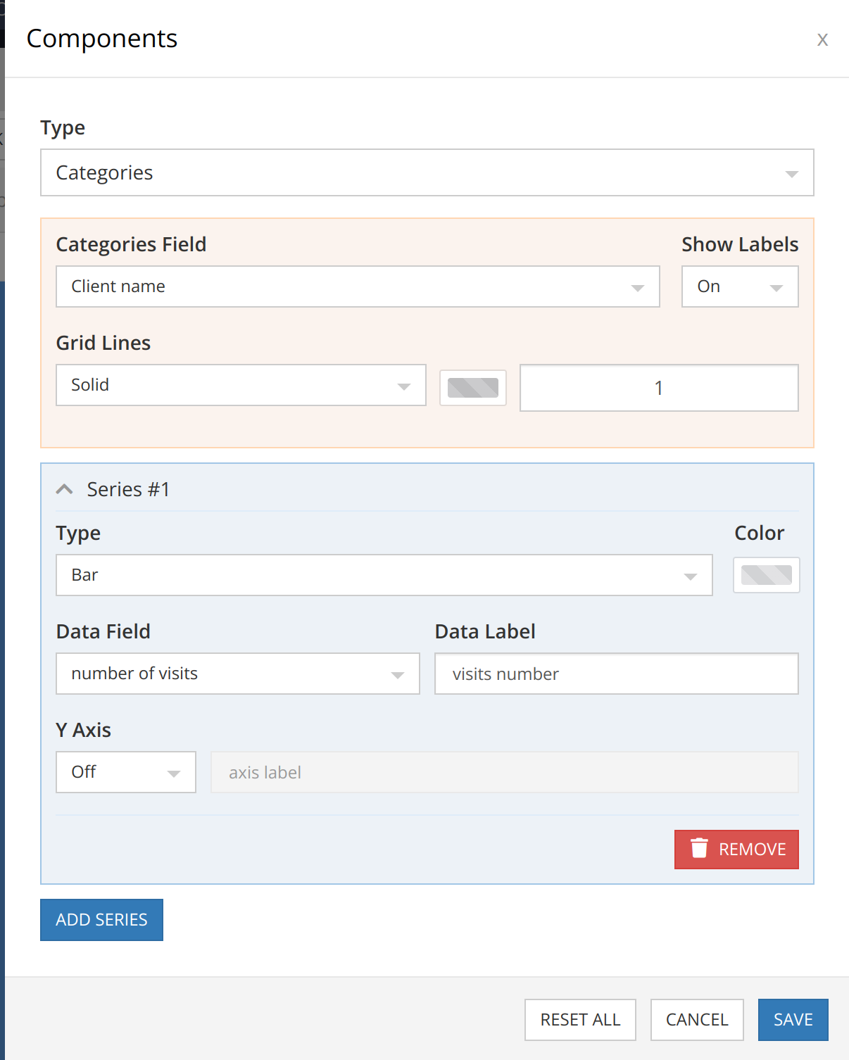
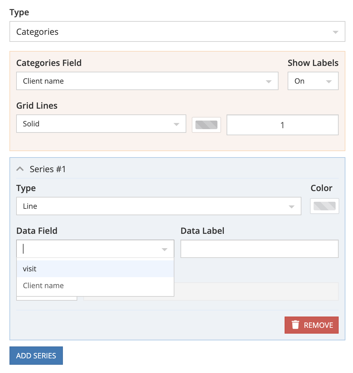
Then my chart look like this. Data Field I can’t see “number of visits”
We have created an internal ticket, BKNDLSS-32477, to add the ability to add series based on the objectId column. We will let you know when it is available.
I have tried to implement what you want, and unfortunately, there is no possibility to make that with visualizations, at least now. The bottleneck for this moment is located in two places: we couldn’t group by day, and Visualizations at this moment haven’t advanced settings for Views(table has)
We’ve released a new version of Backendless and added the ability to build charts using ‘objectId’.
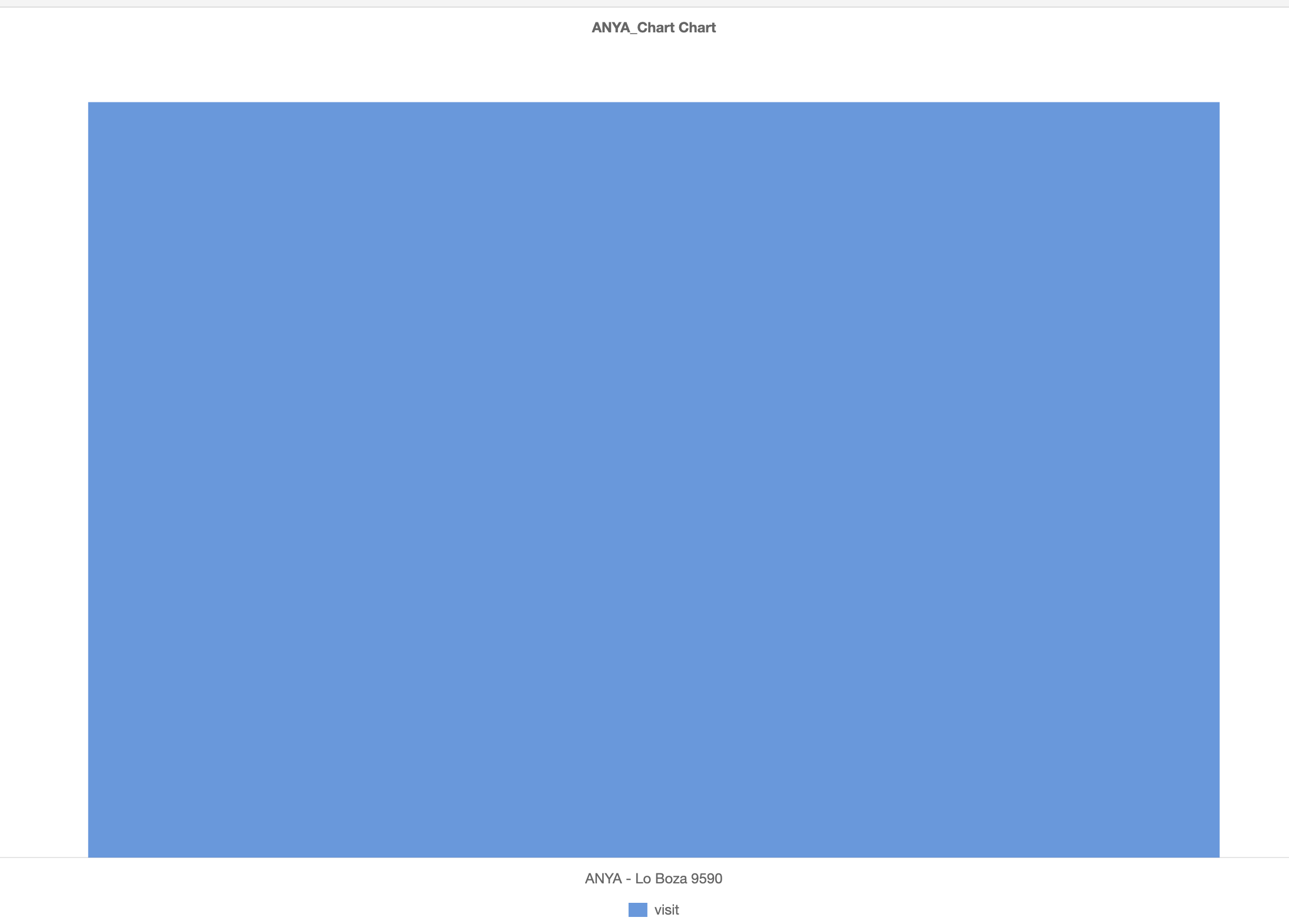
Please, can you confirm that this is working for you?
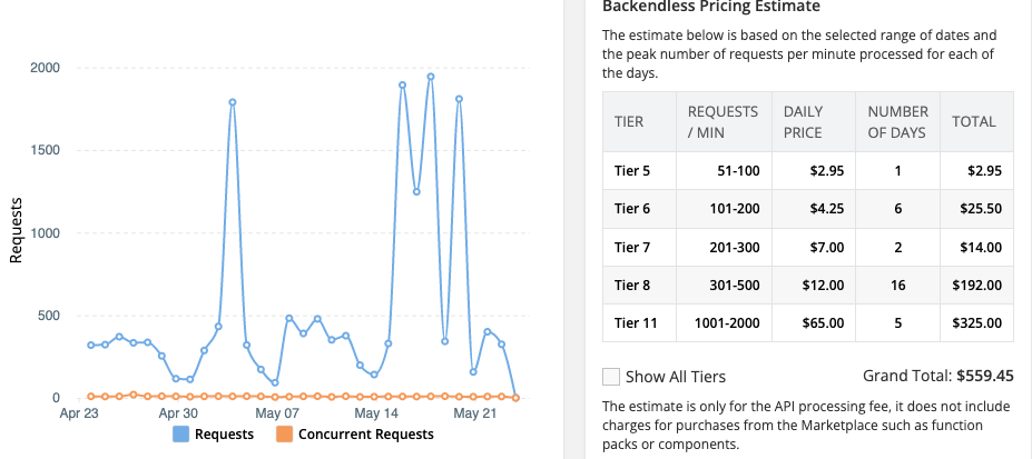
The main problem for chart it’s group or count by day / week / month. Now my solution demand a lot of API calls and with Scale Plan cost to much money at least 1 report US$100.- for year calendar of visitors because are 600/day.
We’re also trying to see if we can use visualizations for users to see some things in a chart. Simple pie chart… but it’s not at all clear how we might be able to do this for individual users.
If we create a data view which groups data by user objectId, where/how does one inject some particular data (for one user) into a pie chart? I mean, is there some way to use logic built into our page in UI Builder to set the data that is presented? Doesn’t seem to be… if there is, please provide some documentation.
How can we style a chart? Things like getting rid of the shadow at the chart border, choose colors in a pie chart, etc?
For now, just a random data view we have. In the visualizations area, it looks like we can just pick a column from the view (pie chart as example) but nothing more. And when dragging the chart into a page in UI Builder, it’s just the chart… no way to query things. I’m sure I’m missing something…
Now for visualizations based on data from a table, we have more options than data from view.
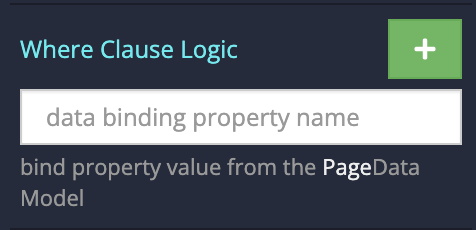
But later for view-based visualizations we will add a “where clause” setting.
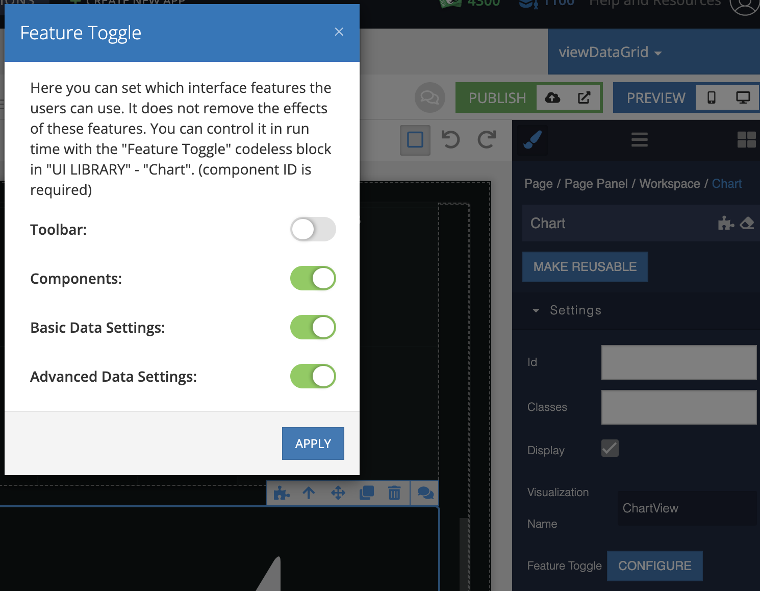
To config the query setting in the ui-builder app fro chart, you need to configure the feature toggle settings. (now there is no setting for the “series” but later it will be)
Thanks for the additional info… but I’m still very confused. Seems like the visualizations area is still undergoing a lot of development. So for now, we have chosen to build a simple custom component for our pie chart requirements
Our use case is very simple: we have users who have some numbers associated with their account. We want to show them those numbers in a chart, so a query with where clause on a data view would work. But the query needs to be unique for each logged in user. Ideally, we have the data in Page Data or App Data for the individual user and we can wire up logic to the chart to present this data.
We don’t need controls, toolbars, interactivity, etc — we just need to be able to show different users different things. From what I can see, there is no logic area where we can set what data is displayed in the chart. It’s just a “global” type thing where all users see the same thing. If I’m wrong, would be great if you sent a screenshot about where we can customize a chart for individual users