Hi there
How do you return the users device type (mobile / desktop / tablet) to UI builder logic?
I’m looking to toggle visibility of page components depending on device type and can’t see how to do this obviously. Am I missing something really obvious…?
Thanks!
Andrew
1 Like
Hello @Andrew_Lawrence
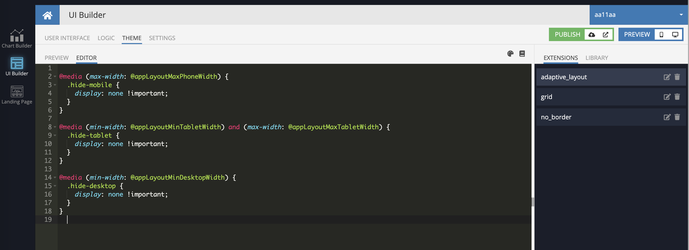
I would recommend you to App Extensions (Styles) instead of logic
@media (max-width: @appLayoutMaxPhoneWidth) {
  .hide-mobile {
    display: none !important;
  }
}

@media (min-width: @appLayoutMinTabletWidth) and (max-width: @appLayoutMaxTabletWidth) {
  .hide-tablet {
    display: none !important;
  }
}

@media (min-width: @appLayoutMinDesktopWidth) {
  .hide-desktop {
    display: none !important;
  }
}
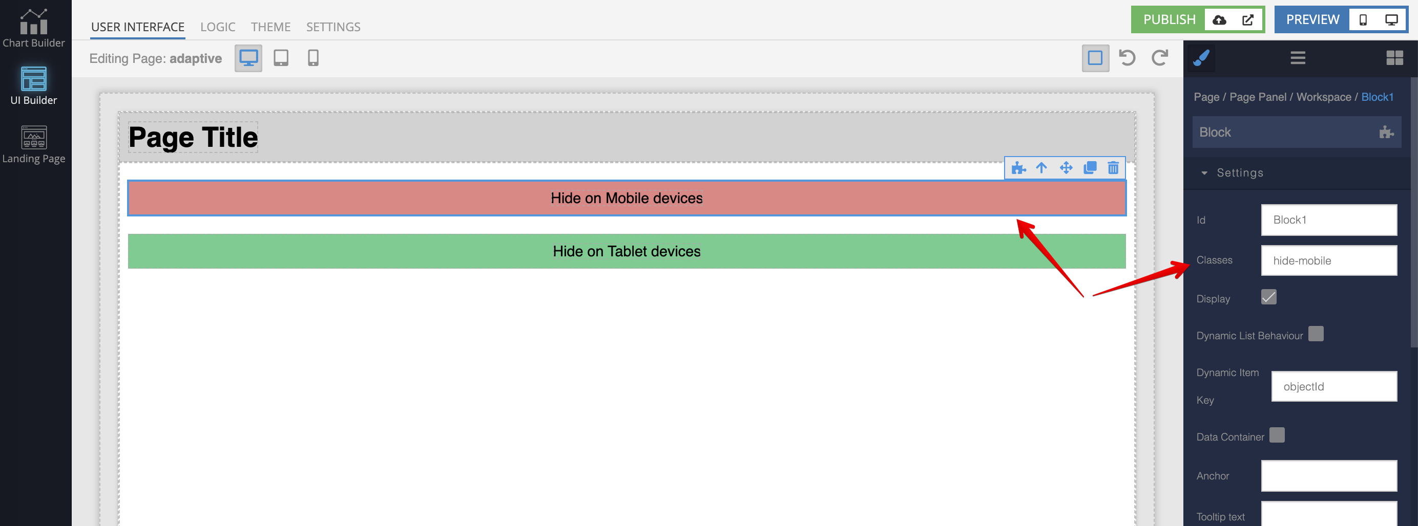
and then, use the classes for whatever blocks you need
here is my app, you play with different screen sizes
https://backendlessappcontent.com/7E25B48A-05FA-0B5D-FFAE-63CC0AC26C00/E9920D04-8F81-D6EC-FFBB-4D4D78486100/files/ui-builder/containers/default/index.html?page=adaptive
Regards, Vlad
Hi Vlad
Thanks for this - I was thinking that might also be a way to go.
Will give it a try…
Andrew