I’m looking to achieve the design below on UI Builder.
I have tried two methods that both aren’t working.
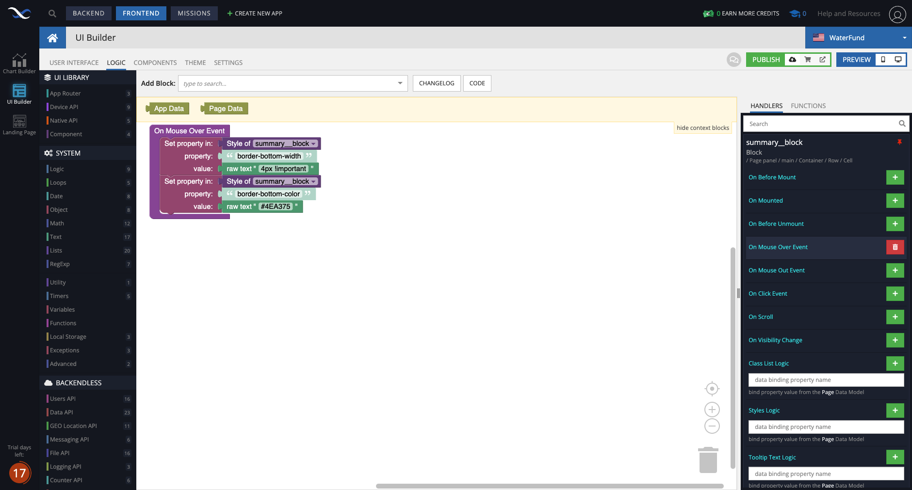
Below, I used codeless logic to change the style of the block on mouse over and on mouse out.
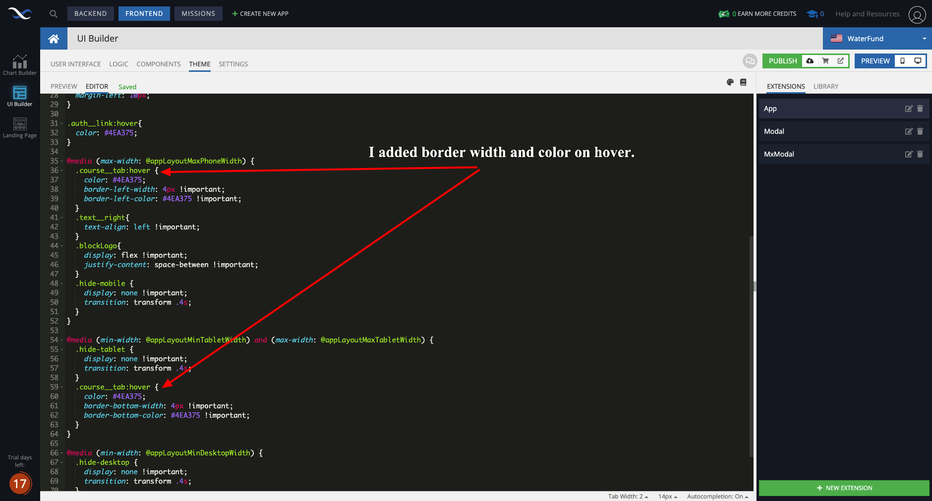
Below, I tried to change the style of the block with CSS
Please advise.
Have you tried inspecting/debugging your CSS with browser’s DevTools’ inspect panel?
Hi Mark,
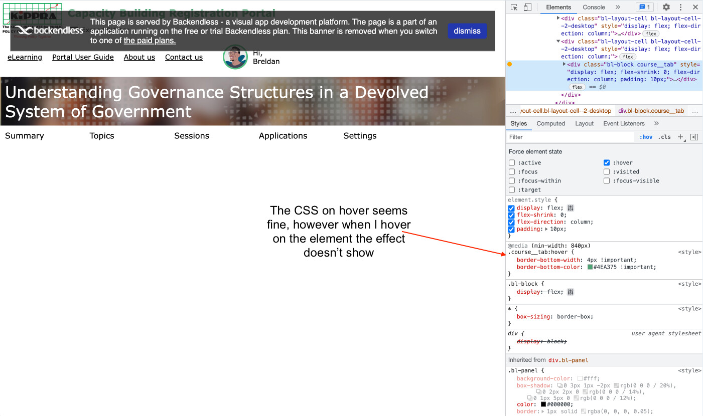
Looking at the dev tools style inspector the CSS on hover is correct based on my Extension.
However, the style doesn’t take effect on the actual element on hover.
Please see below.
Hello @Breldan_Muthaka
Styles in EXTENSIONS have less weight the inline styles from Decoration section and handler event.
I recommend that you migrate all styling logic to EXTENSIONS.
Regards
Hello @viktor.liablin,
I found this tutorial here on the Knowledge Base. Since it was more straightforward to follow I used that instead.
I wanted to add CSS styles on hover to the tab title style to match the tab title current style but I wasn’t successful.
@Breldan_Muthaka
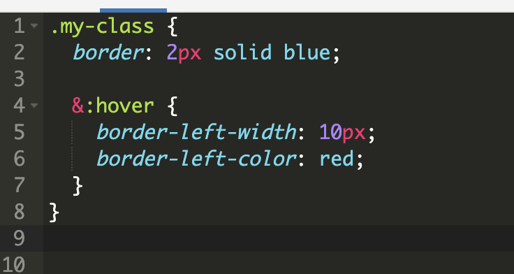
I recommend you to play with this example
Create new block element and don’t set styles in decoration section
Regards
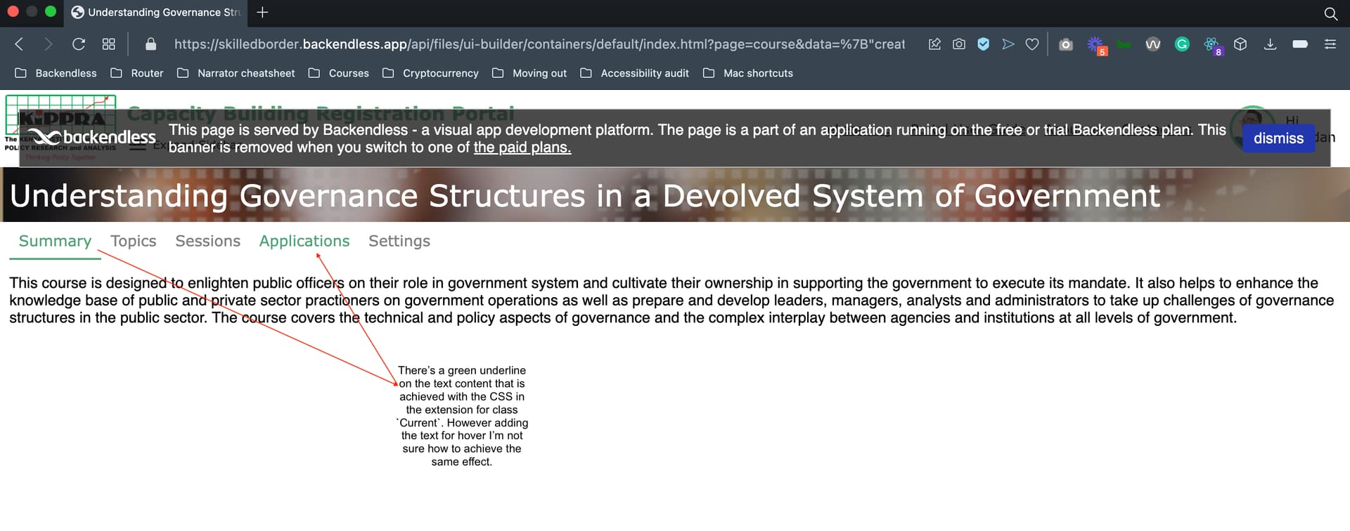
I’m able to change the color of the text on hover. Although I’m not able to create the underline for the tab. Please see the below image.
Below is the CSS in the extension.
.container {
  align-items: center;
  margin: 0 10px;
}

.tab {
  position: relative;
  cursor: pointer;
  &::after {
    position: absolute;
    content: '';
    left: 0;
    bottom: -1px;
    height: 2px;
    width: 0%;
    transition: width .2s ease-in-out;
    background: transparent;
  }
  &.current {
    &::after {
      width: 100%;
      background: #4EA375;
    }
    & .tab__title {
      color: #4EA375;
    }
  }
  &__title {
    padding: 10px;
    color: grey;
    transition: color .2s ease-in-out;
    &:hover{
      color: #4EA375;
    }
  }
}

.content {
  margin: 0 10px;
}
I’ve found a workaround for this using CSS border styles instead.
Please see below
.container {
  margin: 10px;
}

.tab{
  position: relative;
  cursor: pointer;
  &.current{
    & .tab__title{
      color: #4EA375;
      border-bottom: 2px #4EA375 solid;
    }
  }
  &__title{
    padding: 10px;
    border-bottom: 2px transparent solid;
    transition: color, border-bottom-color .2s ease-in-out;
    &:hover {
      color: #4EA375;
      border-bottom-color: #4EA375;
    }
  }
}

.content {
  margin: 0 10px;
}